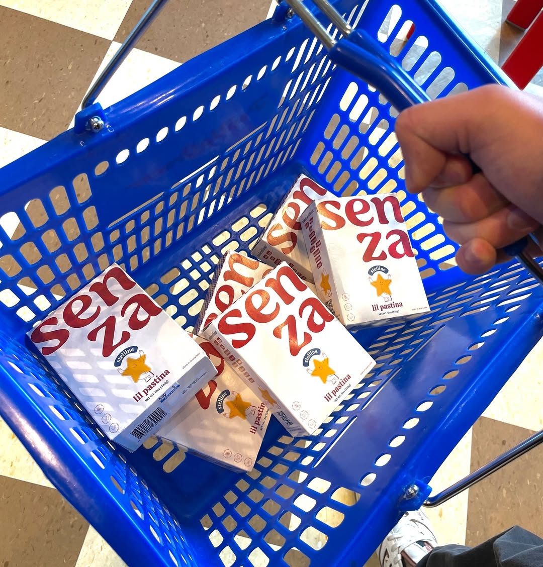
I will always believe that anything mini is better. Senza is a new brand of mini, star-shaped pasta, and it’s the type of mini that makes you crave it immediately.
Designed by Kamila Štěpničková and Abby Doerr, Senza’s packaging leans into simplicity and boldness with its creative use of white space and typography. Splitting the brand name across two lines, with “za” below “sen,” adds an unexpected twist that quickly grabs attention. The right-aligned text adds a touch of asymmetry, setting the design apart in an understated yet impactful way.
The choice to exclude a window to showcase the star-shaped pasta is balanced by the playful star illustration and the whimsical “lil pastina” label, which immediately communicates the brand’s charm.