Bob’s Red Mill, a leader in the homemade food movement for nearly 50 years, is unveiling a brand redesign featuring a new logo and full product packaging refresh. Rooted in the company’s heritage, the new look reflects its enduring commitment to high-quality ingredients and the power of food to bring people together.
A makeover rooted in Bob’s Red Mill’s heritage
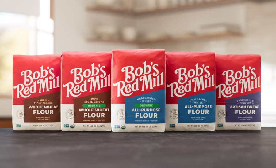
Bob’s Red Mill’s refreshed packaging draws from the brand’s iconic history, with a new look that is both modern and familiar for longtime fans. Core elements of the reimagined design include:
- Mill illustration: The new packaging design features wrap-around storytelling, brought to life by the image of a mill inspired by the original Red Mill where it all began in 1978.
- Logo: The updated logo is simpler, bolder and more recognizable, featuring lettering that feels fresh yet handcrafted.
- Typeface: A custom typeface called “Red Mill,” inspired by hand-painted signage found on farmsteads and old shop windows, brings the same warmth and character as the food inside the package.
- Bob’s Red Mill Seal of Quality: The front of each package features a Seal with Bob Moore at the center, as a symbol of the care, quality and commitment that the brand’s founder passed on to all Bob’s Red Mill employee owners.
- Color palette: Inspired by real places and real ingredients, the updated color palette draws from the original Red Mill and the grains themselves. Color “families” create clear product categories, with consistent dietary callouts.
Bob’s Red Mill remains proudly 100% employee-owned and grounded in the values that have guided the company from the beginning. While the outside has changed, what’s inside has not—a celebration of founder Bob Moore’s belief in simple, high-quality food.
“This is more than a new look—it’s our story, made easier to share,” explains Daniel Barba, Vice President of Marketing at Bob’s Red Mill. “Back in 1978, Bob and Charlee Moore were ahead of their time as they fought the trend toward overly processed foods and convenience over nutrition. Today, our dedication to simple, high-quality food shows up on every package. We think our consumers will love our new look, knowing we are still, simply, unmistakably Bob’s Red Mill.”
Designed to make shopping easier
The refresh also improves the shopping experience. With over 200 products found across multiple grocery aisles, the updated packaging creates a consistent and quickly recognizable shelf presence. Color-coded product categories, increased logo size and clearer placement of Gluten Free and Organic seals make products easier to identify. In focus groups, the company found the design reduced search time by nearly half.
“We wanted the design to feel warm, familiar and authentically Bob’s,” says Margret Brown, Creative Director at Bob’s Red Mill. “We think our consumers will see this as a natural evolution rooted in our history. Plus, our updated design makes products easier to spot, inviting everyone to bring people together with simple, delicious homemade food.”
The project was a collaboration between Bob’s Red Mill’s in-house brand design team and leading design agency Turner Duckworth.
“Design is at its best when it simplifies the path to the things we love,” says Chris Garvey, Executive Creative Director, Turner Duckworth. “Each design element brings people back to the mill, from the containing shape that wraps around each pack, to the custom font with variable characters that convey the warmth and character of hand-painted signage.”
The rollout of this new look will be gradual, with Bob’s Red Mill core flours debuting as soon as September 2026, followed by other product categories throughout 2027.