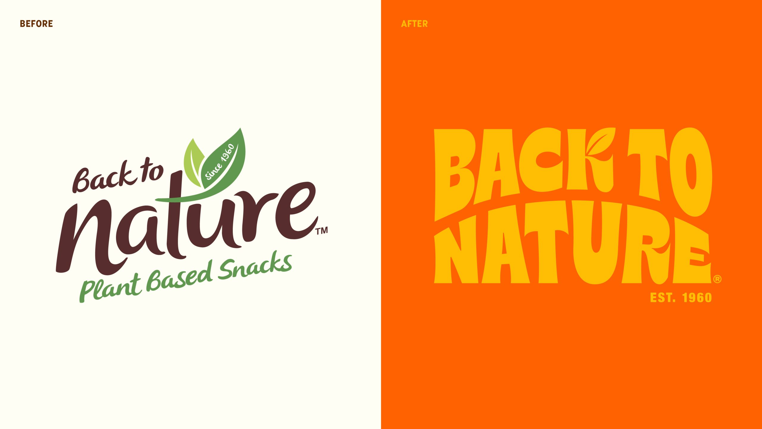
LOVE’s redesign for Back to Nature loses the earthy, folksy look for something a lot bolder and way more playful. The old logo, with its script font and leafy accent, felt too predictable for the category, while the new one leans into chunky typography inspired by vintage signage.
The color palette shifts from neutral and safe to punchy and expressive, with each flavor owning its own distinct hue, making the lineup feel lively on the shelf. The photography is cleaner and more direct, showcasing the snacks front and center, with playful sticker-like callouts adding an extra layer of fun.
Back To Nature’s new design is a great case study to showcase that just because a product is plant-based doesn’t mean the packaging has to be boring.