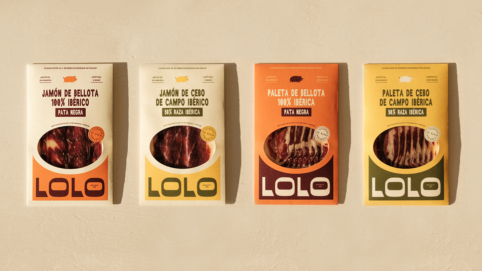
Odds Studio crafted Lolo’s packaging with a juxtaposition of an approach, blending bold typography with warm, dreamy tones. The strong, geometric logotype sits prominently on each pack, creating a striking visual identity that feels both confident and welcoming.
A carefully curated color palette, ranging from deep greens and ochres to bright oranges, is meant to reflect the natural landscapes of Salamanca, Spain (where these sweet meats come from) and the richness of Iberian ham itself. The clean-cut die window adds a tactile element, allowing the product to be seen while reinforcing Lolo’s commitment to quality and transparency.
Djelissa Latini, Co-Founder of Odds Studio shares more about the design process below.