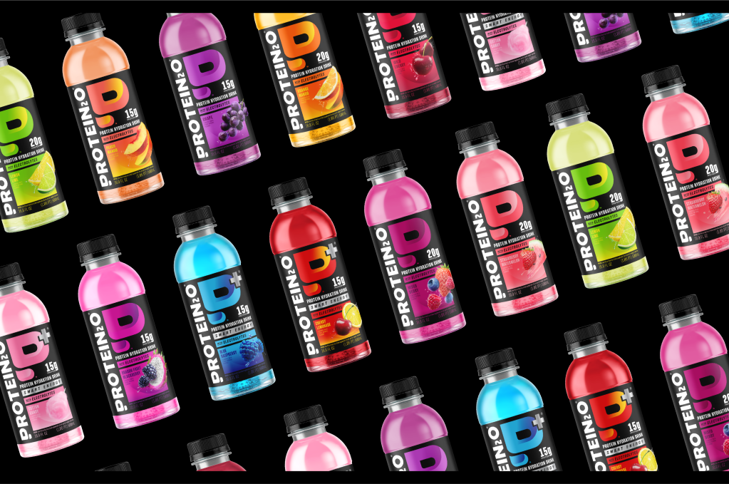
The redesign of Protein2o by Safari Sundays transforms the brand into a more dynamic and fitness-driven identity. The packaging features a bold “P” as a central visual element, reinforcing strength and performance while anchoring the overall look.
A high-contrast black label with bright, gradient-filled fruit visuals amplifies flavor cues, making each variant quickly recognizable. The typography is now heavier and more structured, ensuring clarity and impact, while the updated color blocking and energetic imagery give the brand a confident stance on the shelf.
Priscila Grassi, Design Director at Safari Sundays, gives more information about the design process below.