Maison Fleuret’s Packaging Is a Neutral Canvas For Its Color System

Maison Fleuret’s Packaging Is a Neutral Canvas For Its Color System


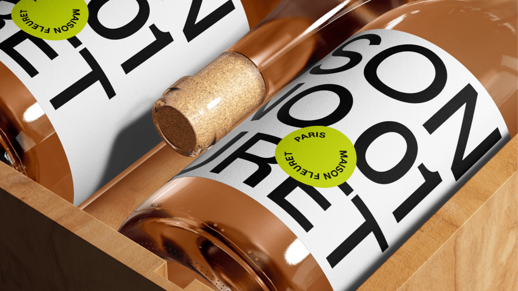
Maison Fleuret’s packaging, designed by Carla Palette, is built around a bold typographic system that prioritizes its clear structure. The packaging features Sterling Sans in a refined, high-contrast layout, where large, all-caps lettering takes over the design, ensuring immediate recognition.

The black and white color scheme is complemented by small, circular stickers in distinctive colors, green, pink, and orange, each subtly differentiating product each variation. Inspired by Parisian signage and editorial design, the crisp aesthetic allows for seamless design repurposing across coffee bags, wine bottles, and to-go packaging.

Carla Palette shares more behind the design process below.


Source link

Get Packaging Industry News updates

Get the most critical Packaging Industry news in your email each week.


We promise no spam email will send you.

Leave a Reply

Your email address will not be published. Required fields are marked *

Related Articles
Packaging firm WINTIPAK picks Heidelberger inline flexo press
Barbara RuckerJul 3, 2026

WINTIPAK, a Switzerland-based supplier of aseptic packaging materials for liquid food, has chosen Heidelberger…

Scanfill unveils recycled PP food-contact film
Barbara RuckerJul 3, 2026

Scanfill has introduced Scanfoil rPP POP (Prevented Ocean Plastic), a new plastic film produced…

PackUK issues 2027 packaging RAM rules 
Barbara RuckerJul 3, 2026

PackUK has released an updated Recyclability Assessment Methodology (RAM), setting out the framework that…

Metsä Board launches Milan packaging design hub
Barbara RuckerJul 3, 2026

Metsä Board has opened a design centre in Milan focused on packaging development with…