Hip Pop’s Bold New Packaging System Puts Flavor Front and Center

Hip Pop’s Bold New Packaging System Puts Flavor Front and Center


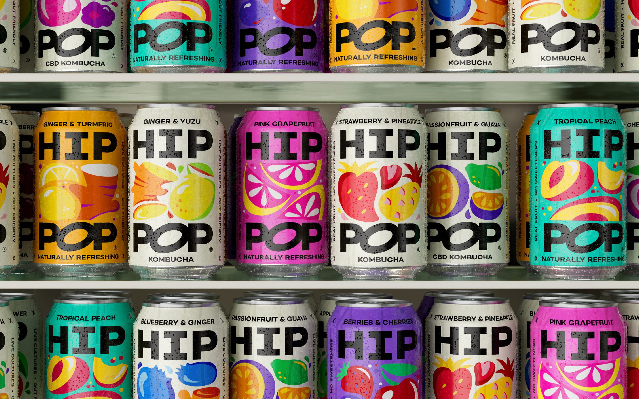
Hip Pop’s updated packaging system, designed by Robot Food, is all about making an impact on the shelf. The previous packaging leaned into playful, illustrated scenes that felt light and whimsical. The new design flips that approach, focusing on bold typography and high-contrast color blocking.

The name “HIP POP” is stacked in oversized black and white letters, while fruit illustrations bring in energy and flavor cues. The packaging balances attitude with clarity, making it clear that this is a kombucha that isn’t like any other.


Source link

Get Packaging Industry News updates

Get the most critical Packaging Industry news in your email each week.


We promise no spam email will send you.

Leave a Reply

Your email address will not be published. Required fields are marked *

Related Articles
GII takes minority stake in food packaging company Hotpack
Barbara RuckerMay 19, 2026

The food packaging company is planning to launch a new plant in Al Kharj,…

Takashi Murakami Brings His Signature Flower Power To Dom Pérignon
Good Grains Makes Cereal Worth Trusting
Barbara RuckerMay 19, 2026

Good Grains by Gel proves that organic cereal can be just as visually exciting…

Last resort Alert: Cut Dr. Wunderer’s Wine Label Into Pieces 
Barbara RuckerMay 19, 2026

Wunderer by Alessandri Design hand-cuts every label with a scalpel and reassembles it in…