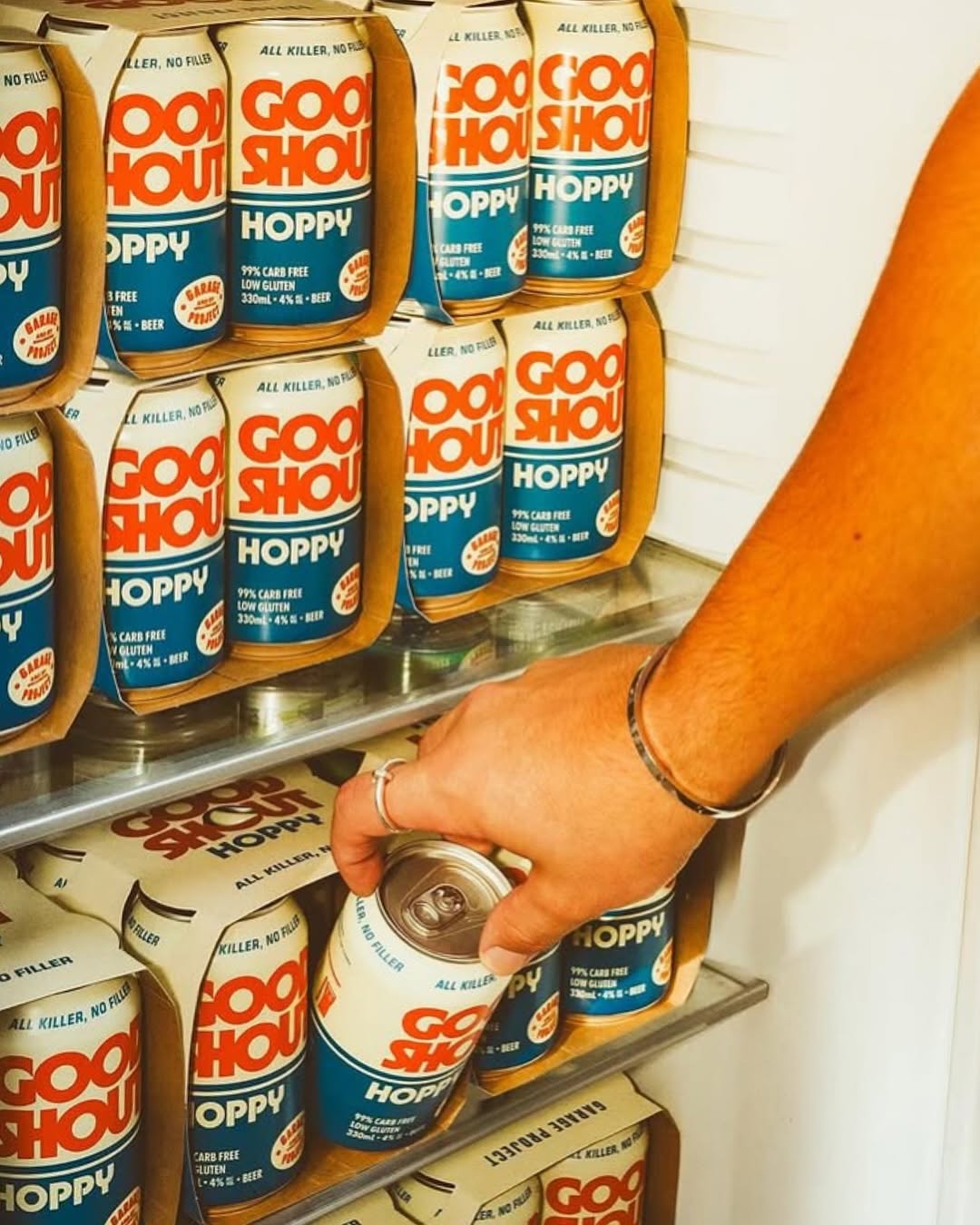
The packaging for Good Shout by Sasso&Co leans into a bold, no-nonsense aesthetic with oversized block typography and a striking red, white, and blue palette.
The all-caps lettering feels straight out of a retro sports arena or a well-loved dive bar sign; it’s familiar, loud, and built for good times. The stacked type commands attention, while the clean layout ensures easy legibility. The design embraces a straightforward, unfussy energy that reflects the beer’s tagline: “All killer, no filler.”
Bart Sasso, Founder of Sasso&Co, shares more about the design process below.