Jameson Gets a Zesty Design From JDO

Jameson Gets a Zesty Design From JDO


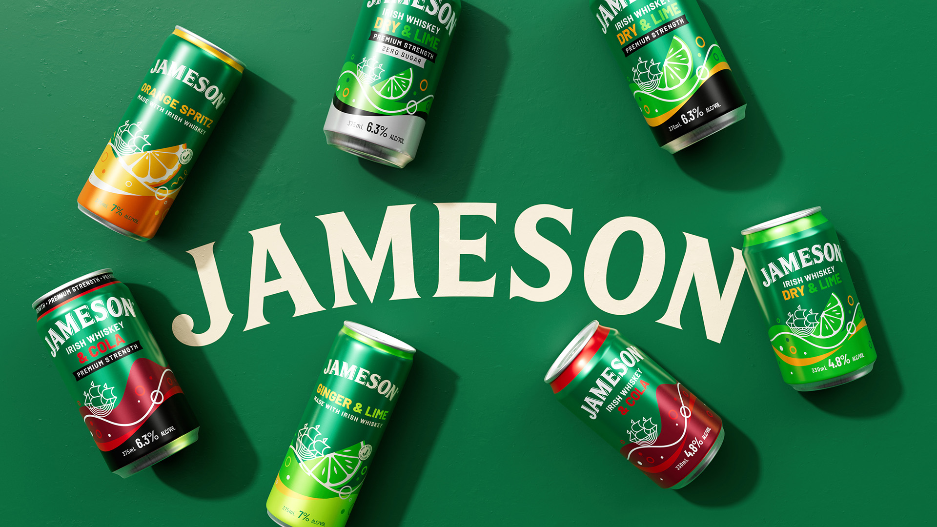
JDO’s packaging for Jameson’s RTD lineup allows the brand feel fresh without straying too far from its roots. Each can is stacked with bold color blocking and citrusy illustrations that clearly communicate the flavors of lemon, lime, or orange, without needing much explanation.

The typography stays true to the Jameson identity, but the layout has more energy and movement. The wave graphic flowing across the cans adds a little fizz, making it feel light, easy, and straight-to-the-point.


Source link

Get Packaging Industry News updates

Get the most critical Packaging Industry news in your email each week.


We promise no spam email will send you.

Leave a Reply

Your email address will not be published. Required fields are marked *

Related Articles
Packaging firm WINTIPAK picks Heidelberger inline flexo press
Barbara RuckerJul 3, 2026

WINTIPAK, a Switzerland-based supplier of aseptic packaging materials for liquid food, has chosen Heidelberger…

Scanfill unveils recycled PP food-contact film
Barbara RuckerJul 3, 2026

Scanfill has introduced Scanfoil rPP POP (Prevented Ocean Plastic), a new plastic film produced…

PackUK issues 2027 packaging RAM rules 
Barbara RuckerJul 3, 2026

PackUK has released an updated Recyclability Assessment Methodology (RAM), setting out the framework that…

Metsä Board launches Milan packaging design hub
Barbara RuckerJul 3, 2026

Metsä Board has opened a design centre in Milan focused on packaging development with…