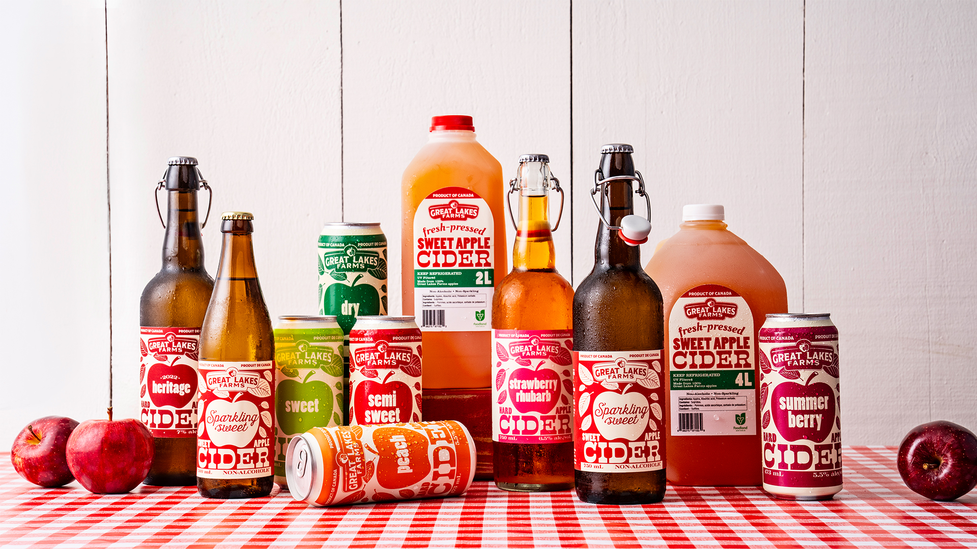
The packaging for Great Lakes Farms Estate Cider, designed by Eye Candy Design, leans into playful typography and big, bold apples that take over the front of each can. Type is oversized and very clear, with “sweet,” “dry,” and “semi-sweet” sitting right inside the apple shapes.
Colors are crisp and punchy, aligning with each cider’s flavor profile, while the brand’s logo is tucked into the leaf above. It’s simple, confident, and gives strong roadside farmstand energy in the best way.
Amanda Devries, creative director and founder of Eye Candy Design, gives us more insight into the design process below.