Orita’s Breaking Beverage Brand Stereotypes

Orita’s Breaking Beverage Brand Stereotypes


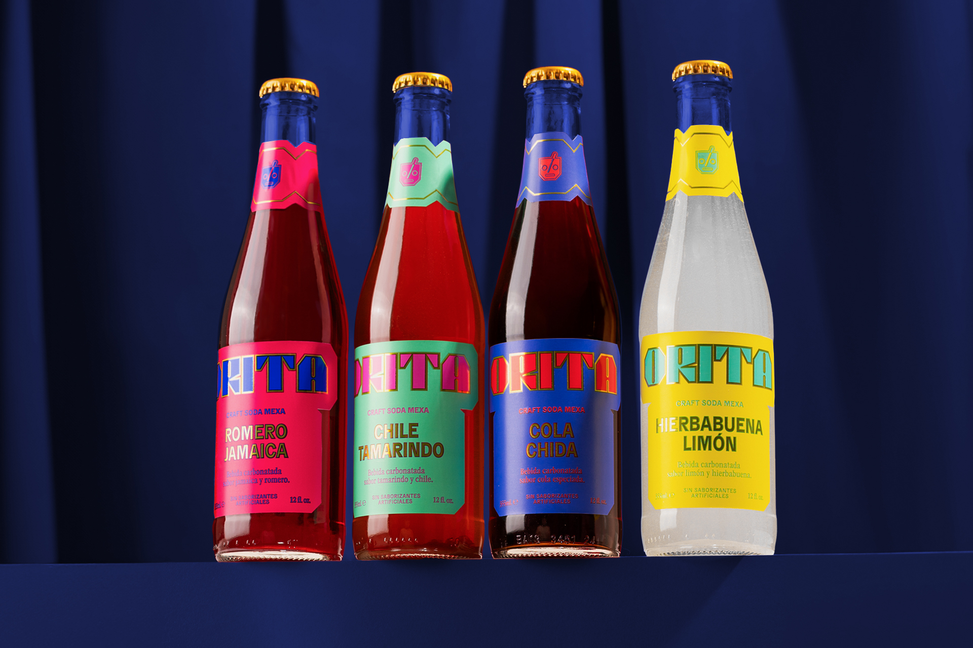
Orita’s packaging, designed by FAENA Studio, doesn’t play it safe. Each bottle leans into maximal color blocking with neon yellows, electric blues, and hot pinks with type that feels pulled from a 70s soda fountain sign.

The logomark wraps the neck like a badge, and it’s bold, cheeky, and impossible to miss on a shelf. The design nails that fizzy, chaotic energy you’d want from a Mexican soda brand reboot.


Source link

Get Packaging Industry News updates

Get the most critical Packaging Industry news in your email each week.


We promise no spam email will send you.

Leave a Reply

Your email address will not be published. Required fields are marked *

Related Articles
Duni Group introduces sealable paper bowl for ready meals
Barbara RuckerApr 29, 2026

Designed for modern food concepts such as sushi, poke, and salads, the round format…

Juno Positions Itself As A Better-For-You Soda Without the Wellness Anxiety
Barbara RuckerApr 29, 2026

Juno Soda by Saint-Urbain brings oversized retro typography and vibrant fruit-coded colors to the…

Deuce’s Design For New UK Gut-Friendly Soda Is Y2K ‘Heaven’
Barbara RuckerApr 29, 2026

Heaven Soda is a new UK brand of gut-friendly pop. Branding and packaging, designed…

Day&Night Spreads the Word on Jam
Barbara RuckerApr 29, 2026

Day and Night’s jam labels by Zukerman Studio throw out every convention in the…