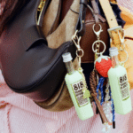
Merune’s packaging, designed by Studio One Eighty, leans into the visual cues of apothecary labels and art history. Each product features an image of its hero ingredient, rendered in a painterly, textured style reminiscent of vintage botanical prints or still-life oil paintings.
The tall, condensed sans-serif wordmark is at the top, while the stacked, center-aligned ingredients list reads like a formula. Bold monochrome backgrounds shift by SKU, giving the lineup a graphic, collectible quality. The design is grounded in nature and refined by its hierarchy.
Jessica Heuse, Owner, Studio One Eighty, gives more insight into the design process below.