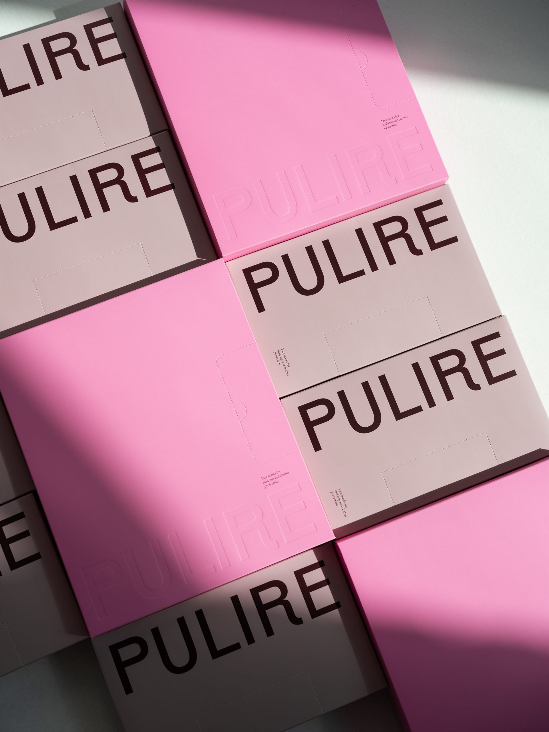
Pulire’s packaging by Daria Stetsenko turns something as utilitarian as makeup face masks into a design-forward object. The box is clean and geometric, with a hot-pink surface embossed with the brand name in oversized sans serif type. The typeface feels distinct but not too clinical.
While the minimal layout and die-cut opening balance function and form, hinting at the contents within. It’s skincare-adjacent design with an editorial flair that we absolutely need to see more of.