Joy Reminds Us That It’s OK To Enjoy Regular Old Soda

Joy Reminds Us That It’s OK To Enjoy Regular Old Soda


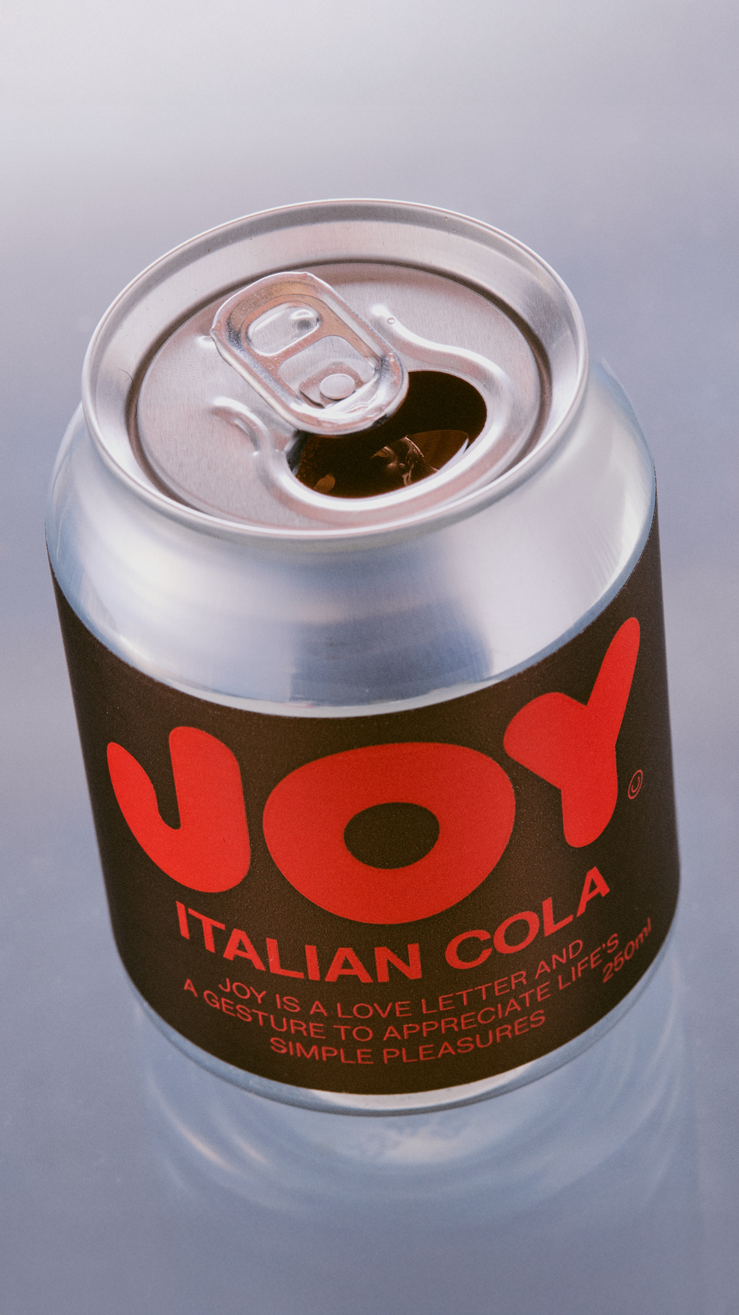
Joy’s packaging resembles a graphic design thesis distilled into a soda can. Designed by Studio of Design and Art , the matte label is punched up with oversized, fire-engine red lettering that reads “JOY” in a custom geometric typeface that’s equal parts playful and declarative.

The short can adds to the visual punch, turning a simple cola into something more playful and unexpected. It’s unapologetic and intentionally maximal, mirroring the name’s promise of “life’s simple pleasures.”


Source link

Get Packaging Industry News updates

Get the most critical Packaging Industry news in your email each week.


We promise no spam email will send you.

Leave a Reply

Your email address will not be published. Required fields are marked *

Related Articles
Packaging firm WINTIPAK picks Heidelberger inline flexo press
Barbara RuckerJul 3, 2026

WINTIPAK, a Switzerland-based supplier of aseptic packaging materials for liquid food, has chosen Heidelberger…

Scanfill unveils recycled PP food-contact film
Barbara RuckerJul 3, 2026

Scanfill has introduced Scanfoil rPP POP (Prevented Ocean Plastic), a new plastic film produced…

PackUK issues 2027 packaging RAM rules 
Barbara RuckerJul 3, 2026

PackUK has released an updated Recyclability Assessment Methodology (RAM), setting out the framework that…

Metsä Board launches Milan packaging design hub
Barbara RuckerJul 3, 2026

Metsä Board has opened a design centre in Milan focused on packaging development with…