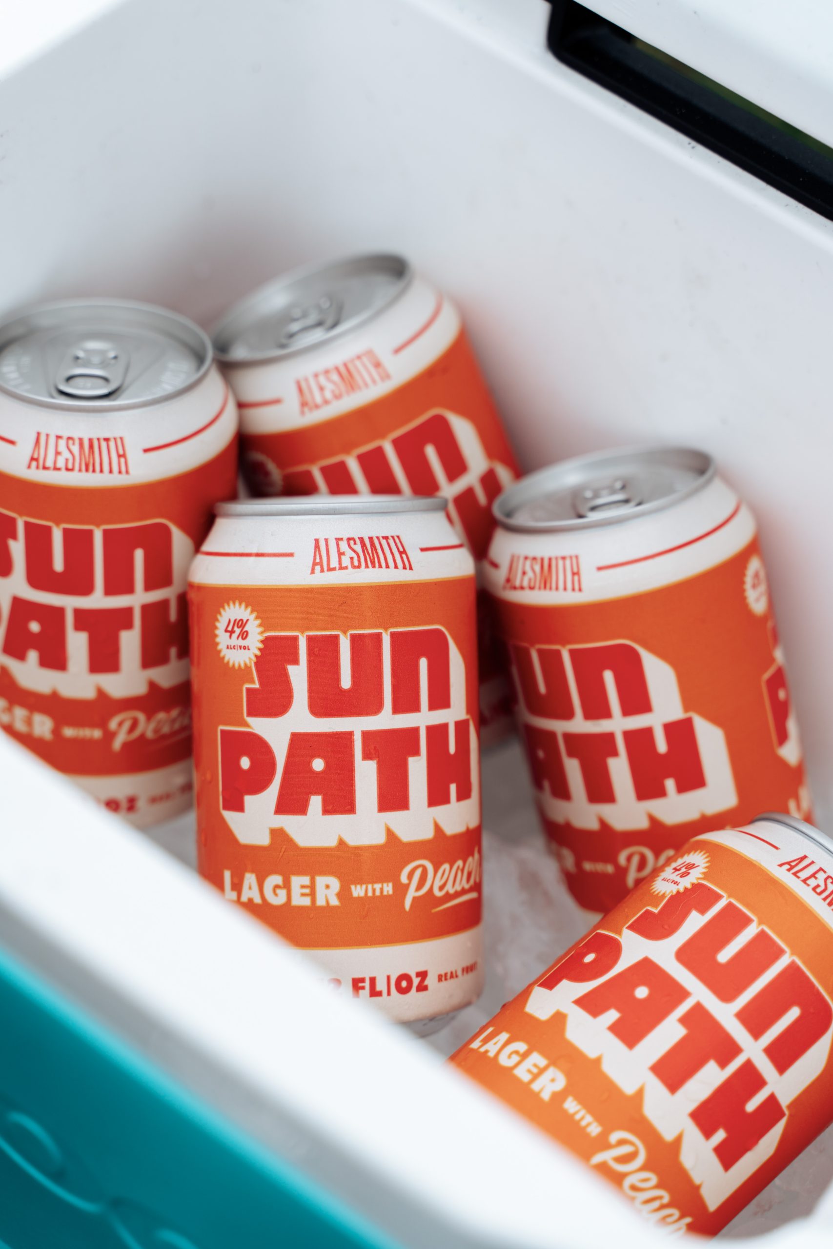
Sun Path’s packaging, designed by CODO Design, feels like summer in a can. The bold, chunky type nearly shouts from the can, while the warm orange gradient nods to sunset drives and roadside fruit stands.
The playful layout and big block lettering make it feel carefree and easy to grab from a cooler. Touches of peach script add a juicy hint to the otherwise no-nonsense lettering. Overall, it looks like something you’d crack open barefoot in the grass; it’s perfectly laid-back, sunny, and full of character.