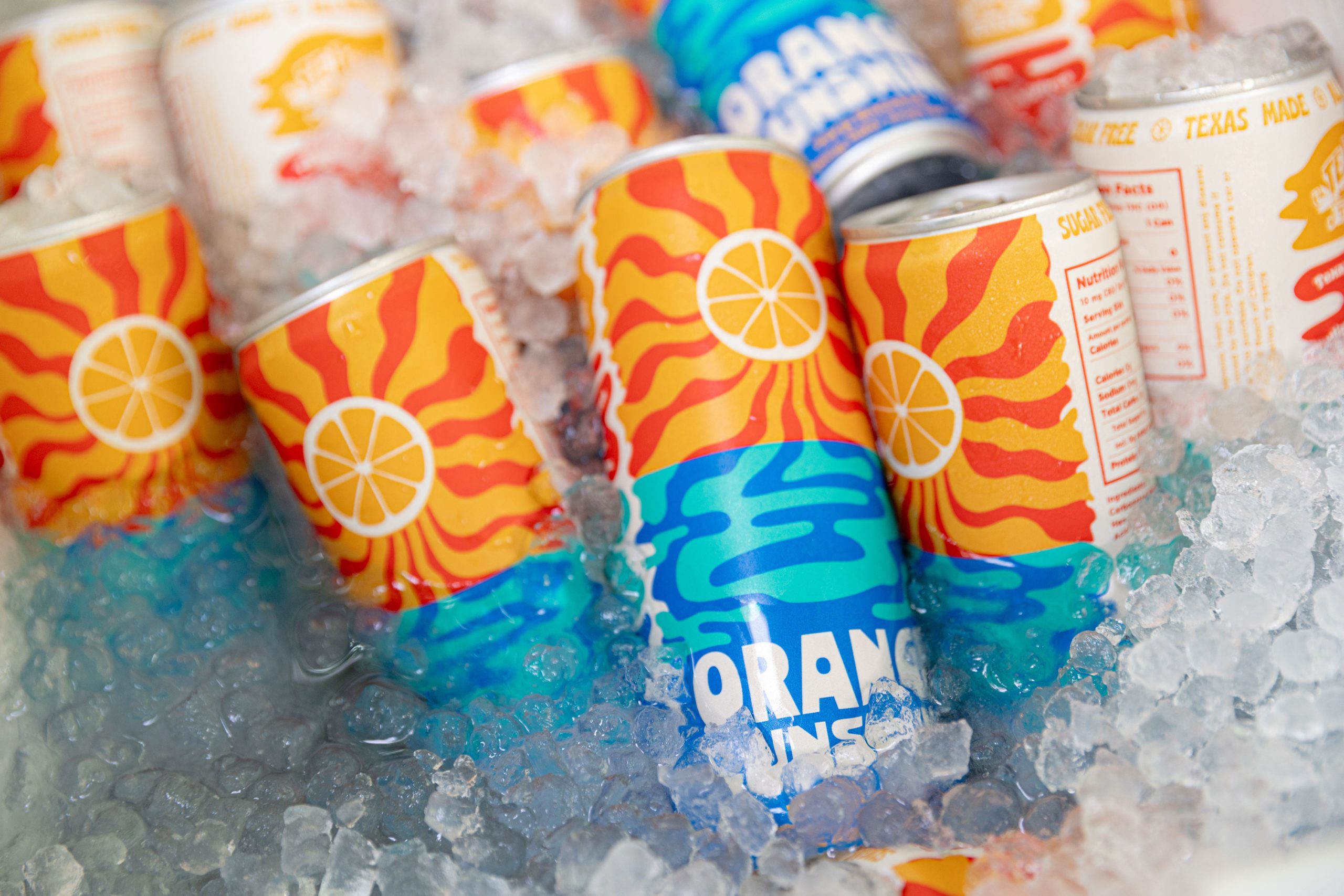
Isa D’Aniello’s packaging for Tejas Tonic’s Orange Sunshine splits the layout into two graphic zones with radiating sunbursts up top and electric blue water squiggles below.
The typography is blocky, stretching wide but without losing legibility. An orange slice anchors the composition like a sun-inspired badge. Overall, the design is loud, saturated, and impossible to miss in a cooler.
Isa D’Aniello answers a few questions about the design process below.