Jameson, the world’s bestselling Irish whiskey, has unveiled a fresh evolution of its iconic green packaging. Familiar yet contemporary, the redesign celebrates Jameson’s quality, craftmanship, rich heritage and personality that fans around the world know and love.
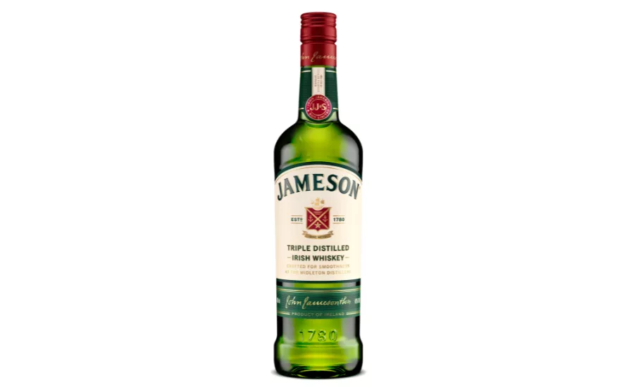
Despite subtle refreshes over the years, Jameson’s instantly recognizable packaging style has remained consistent since 1968, contributing to its global success. Key to this refresh, Jameson makes a small but noteworthy evolution in how it tells its story by proudly anchoring the brand to its home in Midleton, County Cork, for the first time on pack. The redesigned bottle introduces the line “Crafted for Smoothness at the Midleton Distillery” on the front label, a tribute to the singular place where Jameson is made.
This addition underpins the quality of the liquid within, one that is meticulously crafted and triple distilled by a team of experts at the renowned Midleton Distillery. This year, Midleton Distillery was recognized as the World’s Most Awarded International Distillery, a prestigious accolade that honors the quality and craftmanship of whiskeys produced there.
Further subtle, yet impactful changes to the Jameson Original pack include a brighter palette for stronger shelf impact. Raised shoulders highlight the Jameson name, while the refined logo and modernized crest enhance its iconic presence, all laddering up to a cohesive, family-led portfolio design. By elevating tactile details such as increasing foil, introducing textured varnishes, embossing and micro embossing, the redesign also presents a premium look and feel.
The result is a visual evolution that mirrors the journey from the Jameson Distillery Bow Street that began over 200 years ago, to Midleton in 1975, and reinforces the brand’s status as a symbol of Irish whiskey excellence today.
Carol Quinn, Archivist at Irish Distillers comments: “This redesign is about more than aesthetics, it deepens the connection between what consumers see on the shelf and the story behind the whiskey. The journey from Bow Street in Dublin to Midleton in Cork in 1975 was a turning point in Irish whiskey history. At the time, Midleton Distillery was one of the most technologically advanced distilleries in Europe and the move played a key role in a new chapter for the Irish whiskey industry. This visual evolution mirrors that migration from Bow Street to Midleton and celebrates the brand’s status as a symbol of Irish whiskey excellence today.”
Anna Kelly Global Head of Marketing at Irish Distillers says: “The Jameson Original pack restage provided us with an opportunity to link the brand more closely to its proud home at Midleton Distillery. The new messaging on the bottle celebrates Midleton as the center of excellence for Irish whiskey craft and innovation. This refresh reinforces the premium quality of the liquid without losing the approachability and iconic elements that make the brand so recognizable around the world.”
After unveiling the new Jameson Original pack and following its Jameson Black Barrel restage in late 2024, the whiskey brand is setting the stage for a broader transformation. This autumn, the Jameson family continues its packaging refresh with the introduction of a restaged Jameson Crested and Jameson Distiller’s Batch, a new name for the whiskey formerly known as Jameson Single Pot Still.
The new Jameson Original bottle will begin rolling out globally from the end of July 2025, across all formats including 700ml, 750ml, 1L and 50ml.