Baterista Takes You On a Dizzying Typographic Journey

Baterista Takes You On a Dizzying Typographic Journey


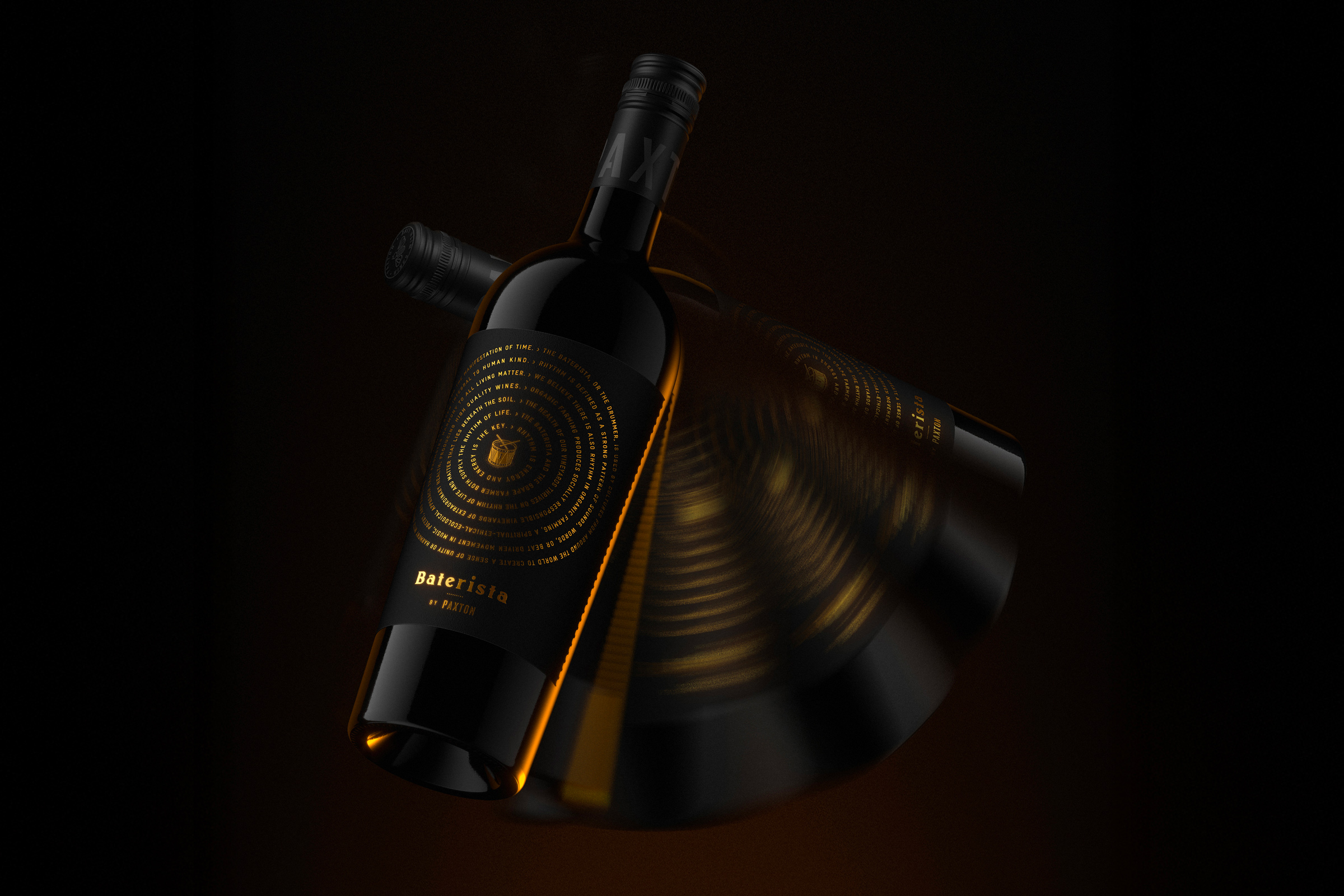
Byerlee Design is behind the packaging for Baterista, a wine with a label that feels mysterious but also approachable.

At the center of the design sits a drum, inspired by the unexpected similarities between drumming and the natural cycles of organic farming. The dark label paired with the rich gold foil and the circular design almost hypnotizes you, drawing you in, begging you to want to learn more. It’s not overdone, but invites the consumer to slow down and learn more about what’s inside the bottle.


Source link

Get Packaging Industry News updates

Get the most critical Packaging Industry news in your email each week.


We promise no spam email will send you.

Leave a Reply

Your email address will not be published. Required fields are marked *

Related Articles
Alpa’s Gluten-Free Pasta Looks Like It Belongs in an Upscale Trattoria
Barbara RuckerJun 18, 2026

We don’t often see brands lead with design first if there’s a functional aspect…

CVS Swaps Plastic OTC Bottles for Aluminum
Barbara RuckerJun 18, 2026

CVS is replacing the plastic bottle packaging for their store brand allergy and pain…

Stillbound Receives a Brandy Bottle Built for the Campfire Crowd
Barbara RuckerJun 18, 2026

Not to be rude, but brandy feels mostly boring these days. But Stillbound, designed…

4 things small businesses forget to order with their
Barbara RuckerJun 18, 2026

TL;DR Summary Ordering boxes is the easy part. It’s everything that goes with them…