• Home
  • Packaging News
  • Alpa’s Gluten-Free Pasta Looks Like It Belongs in an Upscale Trattoria

Alpa’s Gluten-Free Pasta Looks Like It Belongs in an Upscale Trattoria

Alpa’s Gluten-Free Pasta Looks Like It Belongs in an Upscale Trattoria


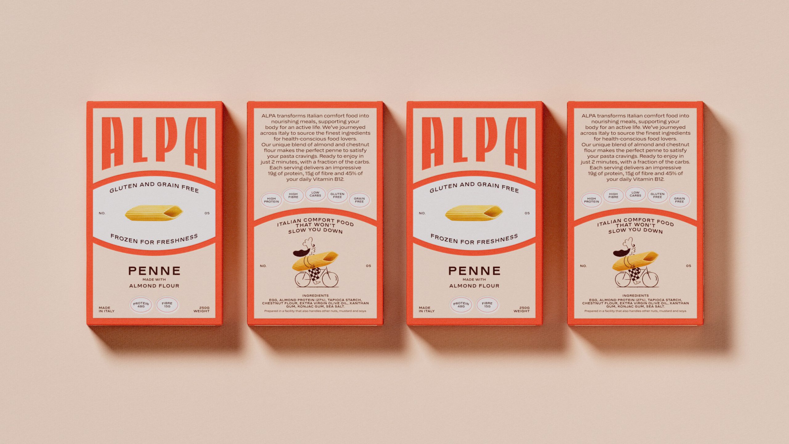
We don’t often see brands lead with design first if there’s a functional aspect of the product. Alpa, designed by Studio Tyrrell, shows that design-led functional food packaging is absolutely possible.

The box features a towering ALPA wordmark in a wide type that bleeds off the top edge. The aesthetic pulls from mid-century Italian graphic design and possesses the kind of typography you’d find on a vintage pasta brand from the 1960s. 

At the center of the front panel sits an oval shape, an element borrowed from Italian label tradition, framing a single photorealistic penne against a clean white ground, which manages to feel both nostalgic and premium at the same time. 


Source link

Get Packaging Industry News updates

Get the most critical Packaging Industry news in your email each week.


We promise no spam email will send you.

Leave a Reply

Your email address will not be published. Required fields are marked *

Related Articles
CVS Swaps Plastic OTC Bottles for Aluminum
Barbara RuckerJun 18, 2026

CVS is replacing the plastic bottle packaging for their store brand allergy and pain…

Stillbound Receives a Brandy Bottle Built for the Campfire Crowd
Barbara RuckerJun 18, 2026

Not to be rude, but brandy feels mostly boring these days. But Stillbound, designed…

4 things small businesses forget to order with their
Barbara RuckerJun 18, 2026

TL;DR Summary Ordering boxes is the easy part. It’s everything that goes with them…

Moozy Put Milk In A Can
Barbara RuckerJun 17, 2026

I’m not sure anything has been repackaged as much or as often as milk. …