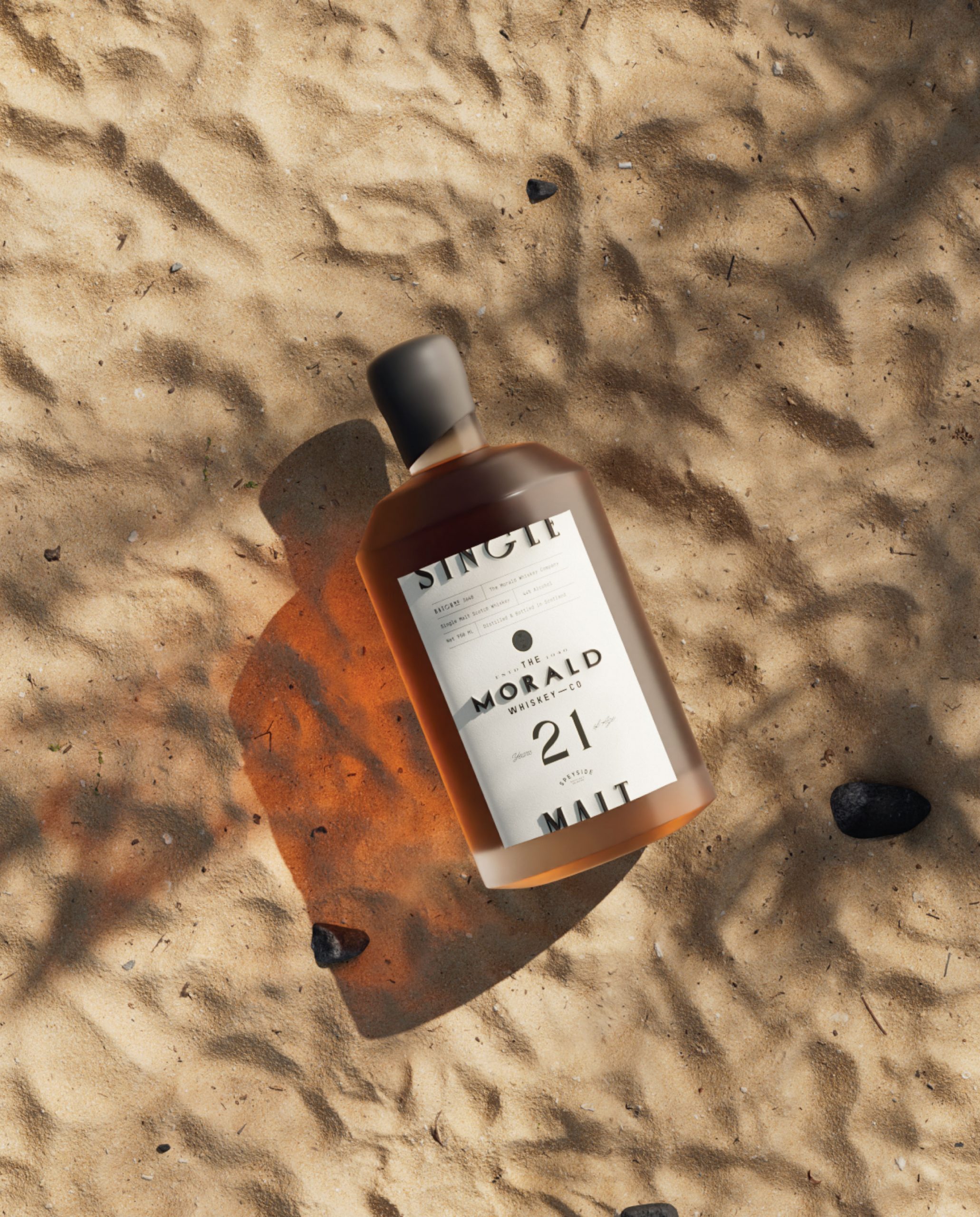
The packaging for The Morald Whiskey Co., designed by Marka Works, leans hard into discretion. The matte bottle and asymmetric black wax seal set a muted tone, while the label pairs serif and sans serif typefaces with an unfussy alignment.
Information is arranged in a clean grid, with the “21” in large numerals grounding the front face. The label avoids unnecessary flourishes, letting negative space and structure do the heavy lifting. Everything looks considered, but not precious.