Mello!’s Packaging Is Loud, Witty, and Built to Pop Off the Shelf

Mello!’s Packaging Is Loud, Witty, and Built to Pop Off the Shelf


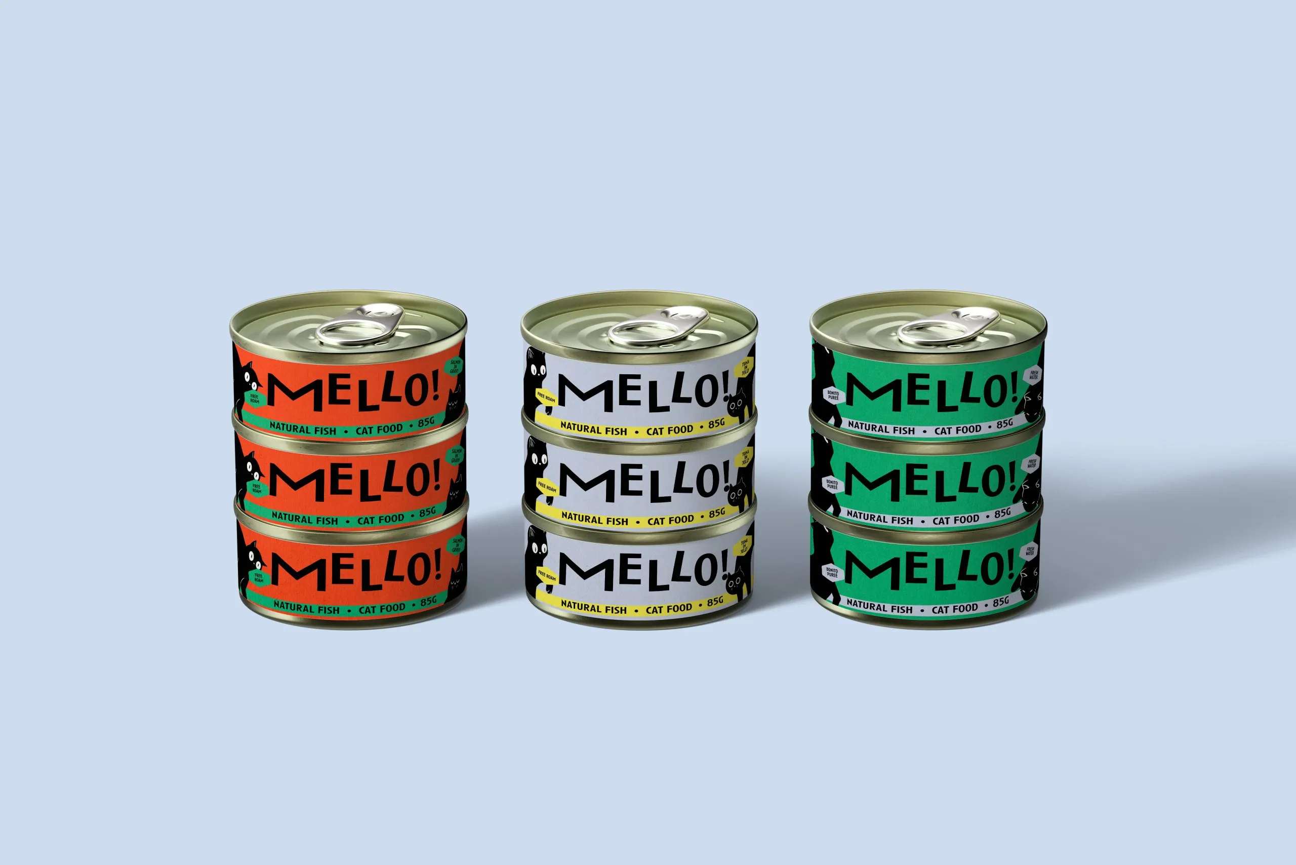
For Mello, tl;dr gave cat food an updated look and feel. The wordmark leans into high-contrast typography, with wonky letterforms and a sharp “M” that doubles as a feline tail swipe. The cans are stacked with punchy colors and little black cats creeping around the labels. Packaging doubles as a billboard, no gradients, no fluff, just bold layouts, oversized type, and unapologetically loud shelf presence.


Source link

Get Packaging Industry News updates

Get the most critical Packaging Industry news in your email each week.


We promise no spam email will send you.

Leave a Reply

Your email address will not be published. Required fields are marked *

Related Articles
So, How Do You Really Feel About AI? Tell Us In Our New Reader Survey
Barbara RuckerMay 20, 2026

Chances are, if you’re a working designer or agency, you have incorporated many of…

HexcelPack and Armor launch VCI paper wrap
Barbara RuckerMay 20, 2026

The material is produced from renewable Kraft paper and is recyclable and repulpable. Credit:…

Pepsi Sends Knicks Fans On The Hunt For Ticket-Winning Cans
Barbara RuckerMay 20, 2026

Pepsi Sends Knicks Fans On The Hunt For Ticket-Winning Cans – DIELINE Pepsi…

Color Does All The Talking For Crumb
Barbara RuckerMay 20, 2026

Crumb’s color-coded body care line proves a great hue system and rounded matte forms…