Never Never’s New Packaging Lets Typography Take the Spotlight

Never Never’s New Packaging Lets Typography Take the Spotlight


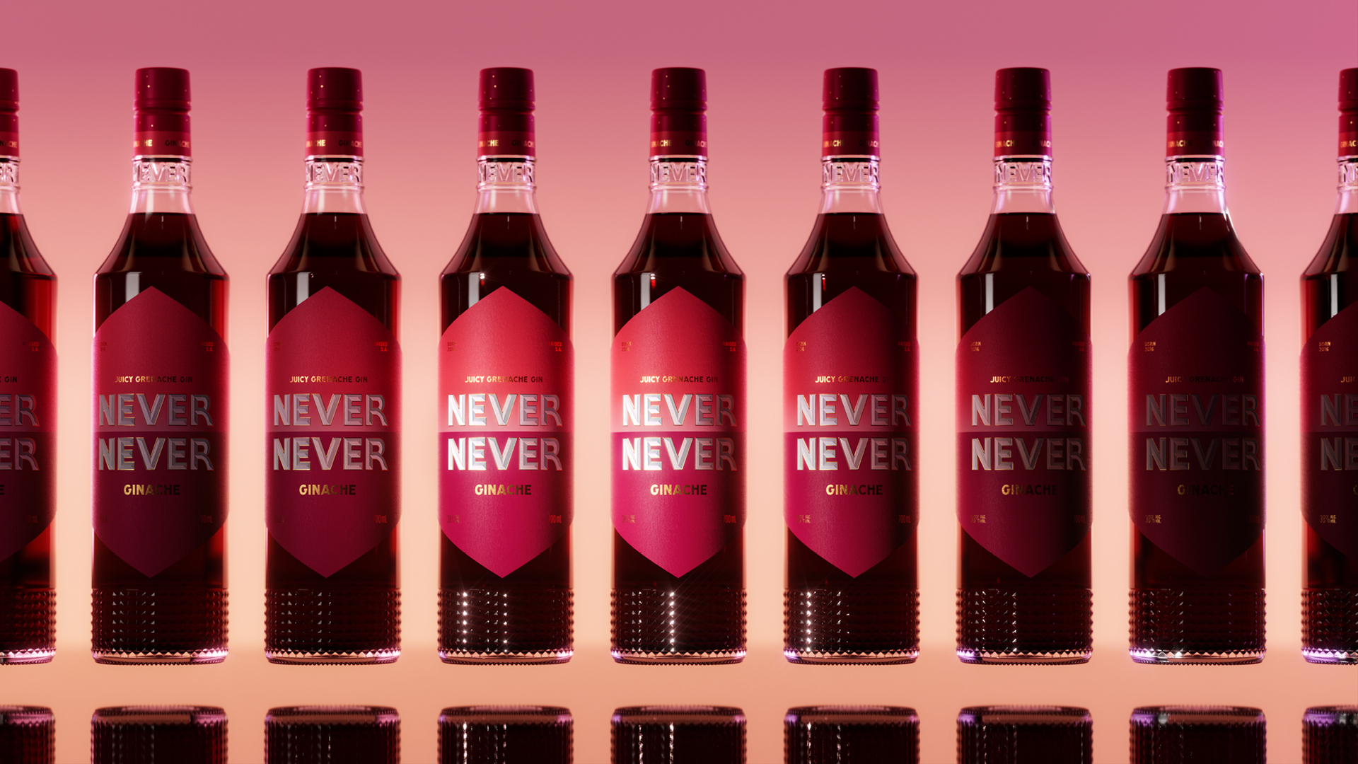
Never Never, designed by SICKDOGWOLFMAN, strips back the clutter and lets bold typography do the talking. The name “NEVER NEVER” dominates the bottle, stamped in sharp metallic lettering that catches the light like a neon sign. A geometric label in saturated colors creates a striking contrast against the clear glass, while the textured base adds tactility and weight.


Source link

Get Packaging Industry News updates

Get the most critical Packaging Industry news in your email each week.


We promise no spam email will send you.

Leave a Reply

Your email address will not be published. Required fields are marked *

Related Articles
4 things small businesses forget to order with their
Barbara RuckerJun 18, 2026

TL;DR Summary Ordering boxes is the easy part. It’s everything that goes with them…

Moozy Put Milk In A Can
Barbara RuckerJun 17, 2026

I’m not sure anything has been repackaged as much or as often as milk. …

Tetra Pak Unveils Industry-First Carton Packaging for Shelf-Stable Tuna
Barbara RuckerJun 17, 2026

Tetra Pak, in collaboration with the Spanish leading seafood producer Jealsa, has unveiled the…

Blue Diamond Almonds Unveils New Flavors and Updated Look
Barbara RuckerJun 17, 2026

Blue Diamond Almonds is officially entering its next chapter, with the company’s first major…