Steam Whistle Toots Its Own Horn With Streamlined Refresh

Steam Whistle Toots Its Own Horn With Streamlined Refresh


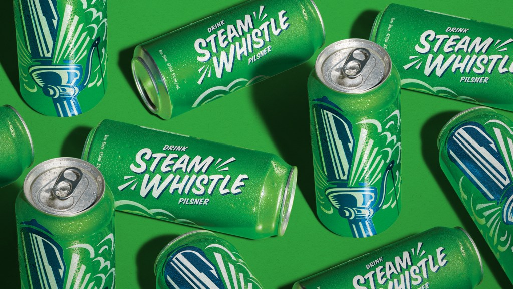
Steam Whistle Brewing’s in-house creative team has given its pilsner a new look that keeps things unmistakably green while tightening up the details. The updated wordmark gets cleaner letterforms with better spacing and more impact, paired with subtle motion lines that lean into the brand’s name.

The packaging system is simplified with fewer distractions, allowing for more focus on the recognizable steam whistle graphic. Compared to the previous design, this version is crisper, more consistent across bottles, cans, and packs, and easier to spot on shelves. It’s a smart evolution without losing what drinkers already know, and proof that a redesign doesn’t have to be a complete overhaul.


Source link

Get Packaging Industry News updates

Get the most critical Packaging Industry news in your email each week.


We promise no spam email will send you.

Leave a Reply

Your email address will not be published. Required fields are marked *

Related Articles
Coca-Cola and Anti Social Social Club Collab Once Again For Summer Capsule
Barbara RuckerMay 14, 2026

At this point, we’ve lost count of how many times Coca-Cola and Anti Social…

Domino to Host X630i Digital Corrugated Press Demos
Barbara RuckerMay 14, 2026

Domino has announced a limited series of demonstrations of its X630i digital corrugated press,…

Canon launches LX-D400 label printer 
Barbara RuckerMay 14, 2026

The printer includes a 4.3in LCD touchscreen. Credit: Canon USA / Globe Newswire. Canon…

Daniel Miller Cracks the Tin Open on Illustrating the World of Fishwife
Barbara RuckerMay 14, 2026

“Making it” as a working artist is a loaded, petrifying concept for many of…