Montara Brings California Energy to Sparkling Verjus

Montara Brings California Energy to Sparkling Verjus


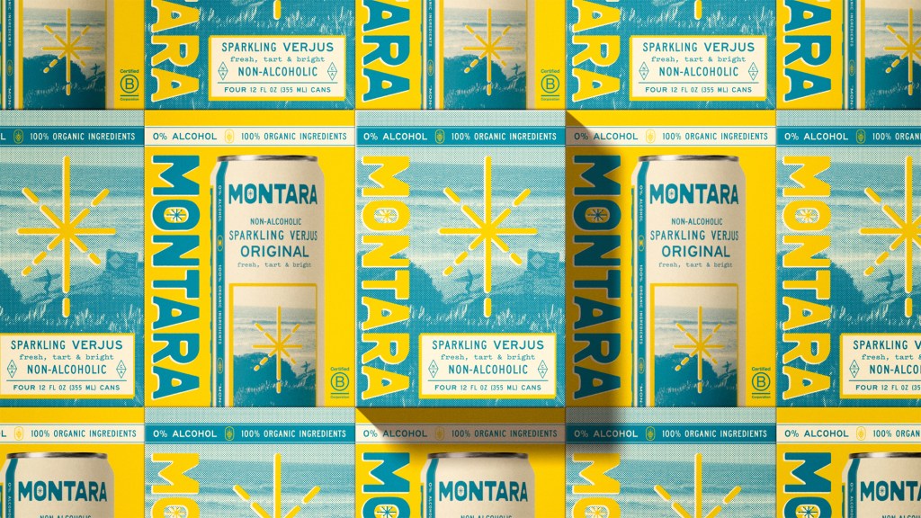
Designed by What Else Studio, Montara’s packaging takes inspiration from the California sunshine with a design that feels as bright as its sparkling beverage. The typography is big, clean, and confidently stacked, with “Montara” running vertically on the can for maximum shelf presence.

The color palette is a sharp mix of electric yellow and ocean blue, creating an instant association with coastal freshness. The starburst icon pulls double duty as a visual anchor and a wink at the drink’s sparkle. The design is perfectly coastal, yet it doesn’t feel clichéd. It balances the aesthetic just right.




Source link

Get Packaging Industry News updates

Get the most critical Packaging Industry news in your email each week.


We promise no spam email will send you.

Leave a Reply

Your email address will not be published. Required fields are marked *

Related Articles
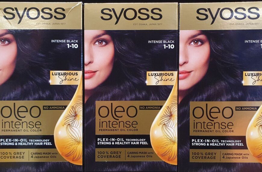
Syoss pack updated through industry partnership
Barbara RuckerMay 29, 2026

MM Packaging oversaw the production stage of the project, which was completed over eight…

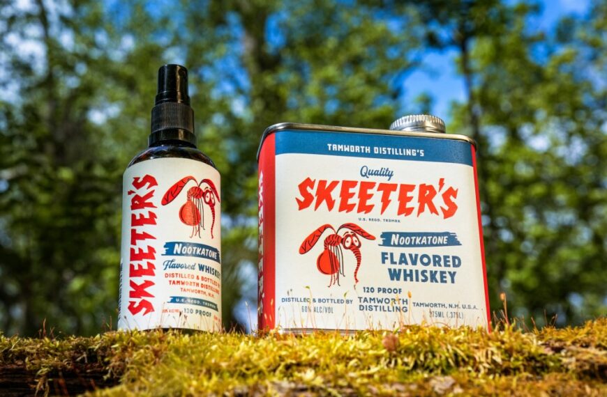
Buzzkill No More: Skeeter’s Nootkatone Flavored Whiskey Protects Your Summer Cocktails
Barbara RuckerMay 29, 2026

Tamworth Distillery has released Skeeter’s Nootkatone Flavored Whiskey, an insect repellent for cocktails Designed…

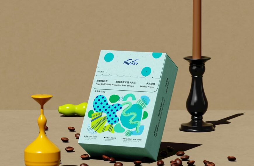
Myaizg Borrows Ciggy Pack-Cool and Injects Its Coffee With Whimsy
Barbara RuckerMay 29, 2026

Coffee packaging has always been an interesting topic to discuss, and it’s often caught…

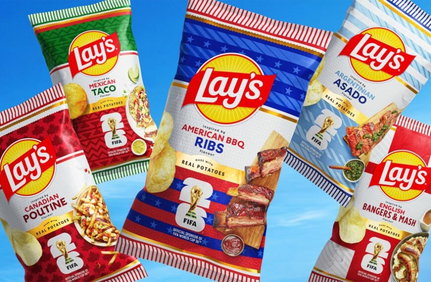
Lay’s Turned Soccer Scarves Into Country-Coded Chip Bags For The World Cup
Barbara RuckerMay 29, 2026

Lay’s has a long history of leaning into limited edition collaborations to drive cultural…