PAZ Powers Up With Kinetic Attitude

PAZ Powers Up With Kinetic Attitude


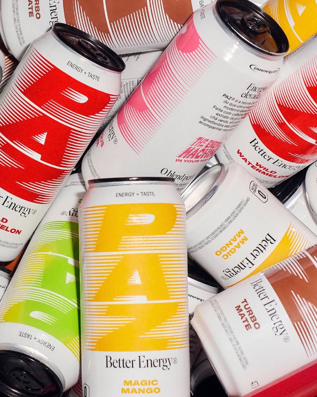
PAZ’s packaging, designed by HardCoure, is pure visual energy. The oversized, vertical “PAZ” lettering takes over the can in the best way possible. The typography stretches and warps with kinetic lines, creating the illusion of motion, which is perfect for a beverage that promises an energetic boost. The minimal lower half keeps it clean, letting the logo do the talking. It’s confident, loud, but absolutely different from other energy beverages within the space.


Source link

Get Packaging Industry News updates

Get the most critical Packaging Industry news in your email each week.


We promise no spam email will send you.

Leave a Reply

Your email address will not be published. Required fields are marked *

Related Articles
IDFA Seeks Temporary Exemptions for Dairy Packaging under California’s SB 54
Barbara RuckerJun 27, 2026

The International Dairy Foods Association (IDFA) on Friday urged the Packaging Producer Responsibility Advisory…

rePurpose Global Launches Packaging Simulator in Light of New Legislation
Barbara RuckerJun 26, 2026

rePurpose Global, the world’s leading Packaging Compliance and Sustainability Platform, has announced the launch…

Update to California SB 343 Recognizes Carton Recyclability
Barbara RuckerJun 26, 2026

Following a thorough review of additional information regarding new carton sortation for recycling across…

From Screen to Shelf: Why Context Wins in Real-World Packaging Design
Barbara RuckerJun 26, 2026

There’s a simple truth brands need to hear: if your packaging only works on…