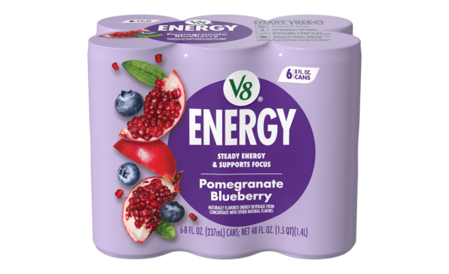
V8 Energy is turning a new page with freshly redesigned packaging. The brand is redefining how energy drinks can look on the shelf while staying true to its commitment to better-for-you flavor and function.
The new design introduces:
- Modern, bold visuals that clearly communicate flavor and functionality
- Clean, streamlined typography for easier shelf readability
- Color-coded flavor cues to quickly guide consumers
- Packaging that reflects the active, health-conscious lifestyle of today’s energy drink buyer
“V8 Energy refreshed its branding and packaging to better align with consumers’ expectations for a better-for-you energy drink that delivers steady energy and supports focus. The redesign highlights the brand’s delicious, fruit-forward flavors with bold colors and mouthwatering fruit imagery, while also reinforcing key product benefits through easy-to-navigate icons,” said Cory Brooks, Senior Design Manager at The Campbell’s Company. “By leveraging its in-house design team, V8 Energy evolved the graphics to feel more modern, flavorful, and impactful—both on shelf and online.”
This refresh is not just about aesthetics; it’s about connecting with a broader flavor and function seeking audience while maintaining the trusted V8 Energy essence that is helping people pour energy into what matters most.