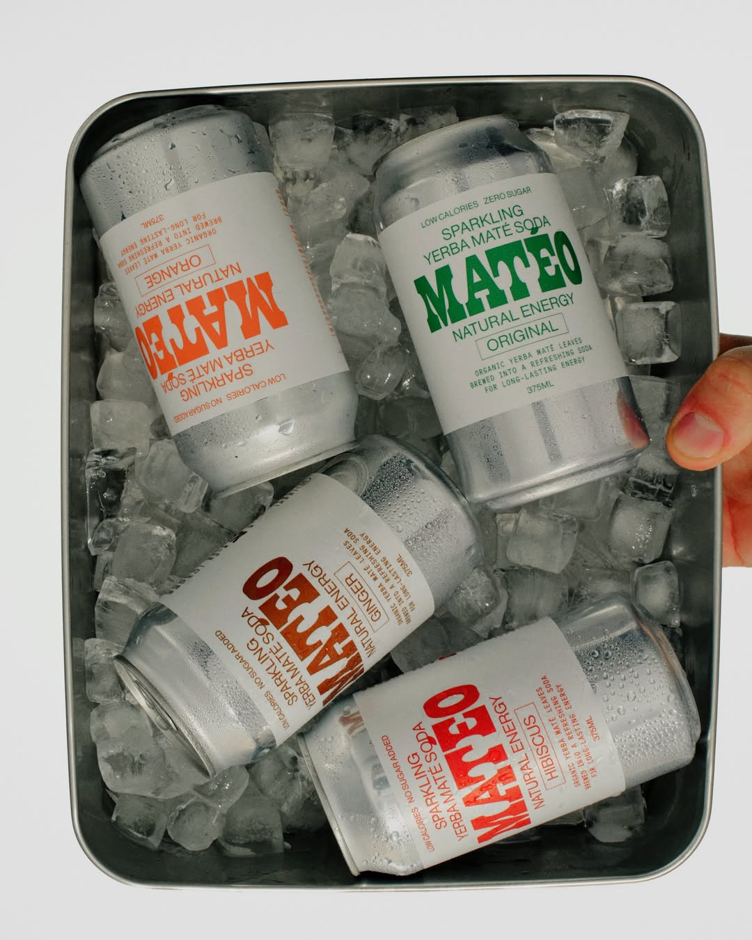
Matéo Soda is the kind of brand that proves Western and country influences aren’t going anywhere any time soon. Instead, they’re just getting cleaner and more design-led. Designed by Studio of Design and Art, the can’s oversized slab lettering feels unapologetically direct.
The stark white label and stripped-back typographic system mirror founder and former chef Olie Ford’s goal of creating a refreshing drink with real integrity. Instead of leaning into rustic clichés or typical energy-drink chaos, the design is maximalist minimalism in action. It’s loud in presence, but minimal in noise.