Hello Klean’s Design Makes Minimalism a Little More Fun to Lather Up

Hello Klean’s Design Makes Minimalism a Little More Fun to Lather Up


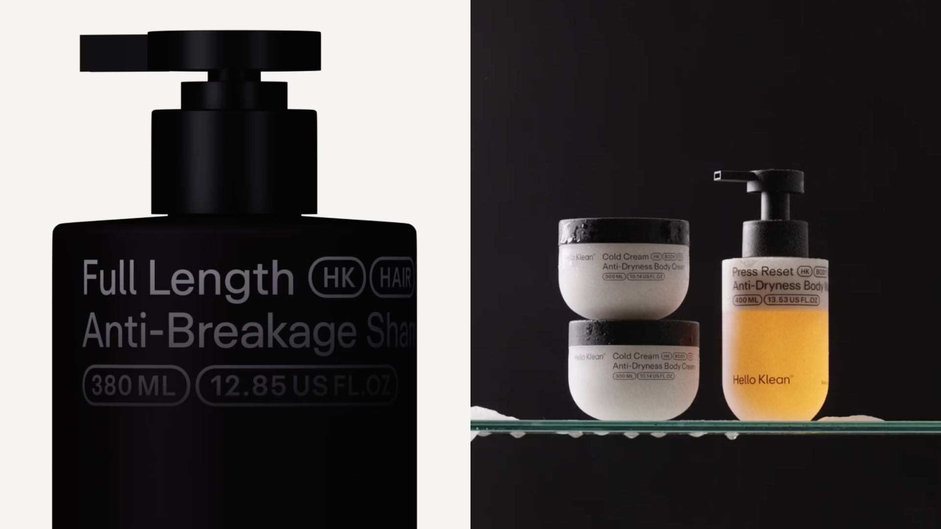
Finally, a personal care line that makes minimalism more interesting.

Hello Klean’s packaging from Two Times Elliot keeps the graphics ultra-spare, with crisp sans-serif type and pill-shaped labels.

The surprise, however, is the silhouette. The rounded bottles and jars, which feel almost cushiony, are a gentle juxtaposition to the more clinical text system. There are no illustrations, just a clean hierarchy and a little wink of softness. We’re seeing this rounded vessel shape in to-go coffee cups, and I think it’ll start making its way into more and more categories. Beauty is clearly next. 


Source link

Get Packaging Industry News updates

Get the most critical Packaging Industry news in your email each week.


We promise no spam email will send you.

Leave a Reply

Your email address will not be published. Required fields are marked *

Related Articles
Alpa’s Gluten-Free Pasta Looks Like It Belongs in an Upscale Trattoria
Barbara RuckerJun 18, 2026

We don’t often see brands lead with design first if there’s a functional aspect…

CVS Swaps Plastic OTC Bottles for Aluminum
Barbara RuckerJun 18, 2026

CVS is replacing the plastic bottle packaging for their store brand allergy and pain…

Stillbound Receives a Brandy Bottle Built for the Campfire Crowd
Barbara RuckerJun 18, 2026

Not to be rude, but brandy feels mostly boring these days. But Stillbound, designed…

4 things small businesses forget to order with their
Barbara RuckerJun 18, 2026

TL;DR Summary Ordering boxes is the easy part. It’s everything that goes with them…