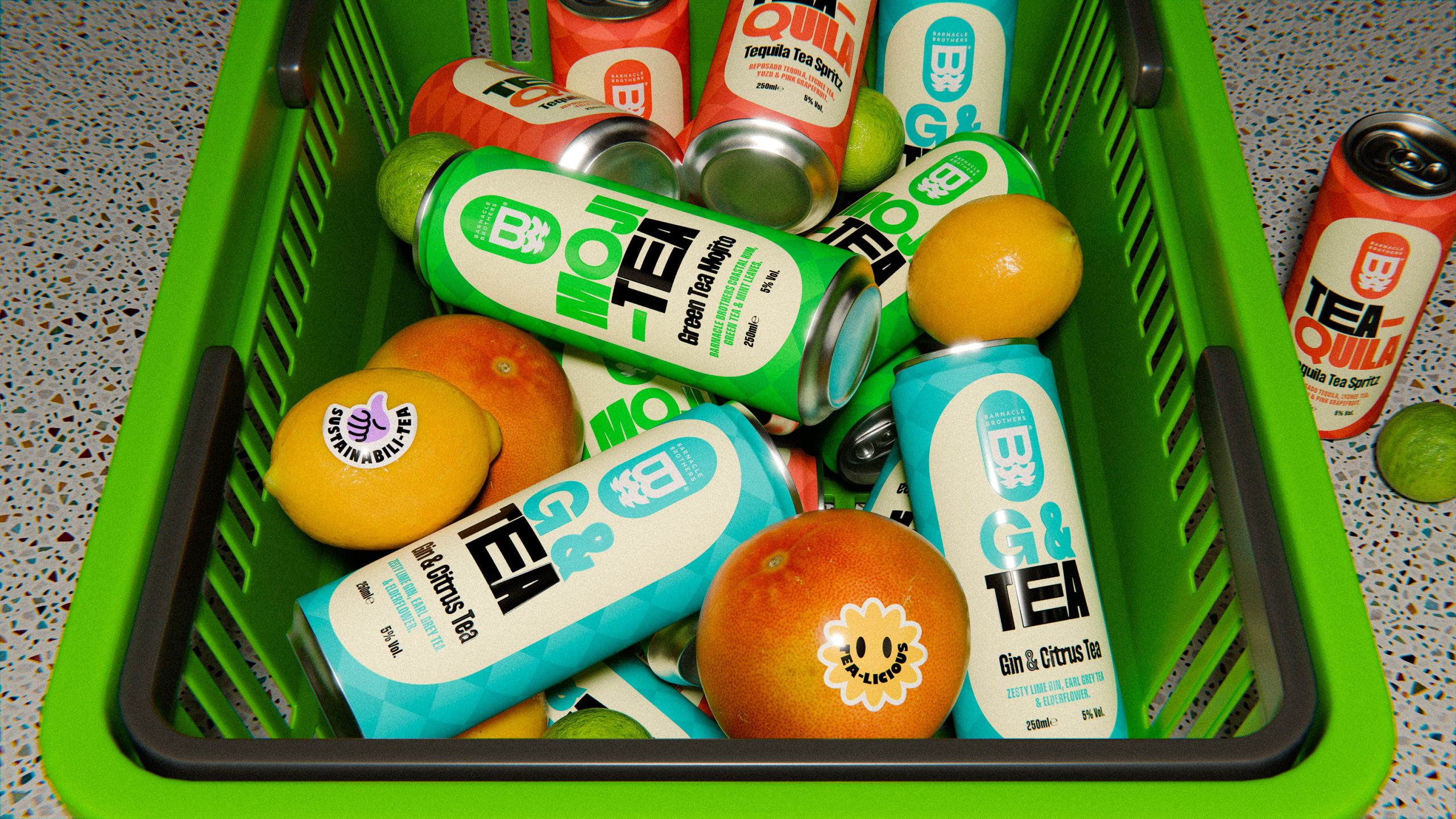
I love when a can is bold and bright, with the beverage aisle being so crowded, it only makes sense.
For Barnacle Brothers Tea Infused Cocktails, Monday Creative creates color driven system where each variant is defined by a single hue. Large stacked typography, like TEA QUILA and MOJI TEA, commands attention while keeping the layout structured and easy to read.
A subtle diamond pattern adds geometric texture across the surface and cleverly references the outline of the Isle of Wight. By stripping back illustration and letting color, type, and pattern do the work, the packaging goes against an overdesigned category.