When everyday bread packaging is treated with the same confidence as tech branding, my heart skips a beat.
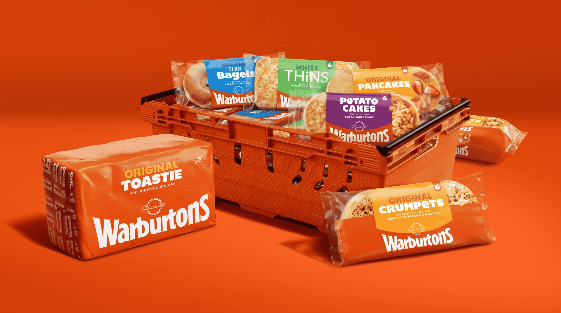
Warburtons’ redesign from Taxi Studio feels unmistakable on the shelf, creating a unified system that makes your eyes skip over any other brand. Marking 150 years as Britain’s biggest bakery brand, the refresh brings more than 70 products together under one identity, using the Baked Orange hue that builds a full wall of recognition in store. The typography features a clean sans-serif lettering that feels friendly without competing for attention. Details like the elevated Family Seal of Quality and Jonathan Warburton’s signature add a layer of trust and craft without cluttering the design. It’s simple, but doesn’t feel shallow.
The design confidently strips everything back while still feeling full of character, turning a familiar staple into something that looks fresh.