Keurig Dr Pepper (KDP) has refreshed the US packaging graphics for its iconic Canada Dry brand for the first time since 2010, infusing the 120-year-old brand with contemporary energy.
The new packaging design rolled out in May 2024, shortly after the launch of a new entrant in the product lineup, Canada Dry Fruit Splash. Cans and multipack cartons for the entire portfolio of Canada Dry products are moving to the new design.
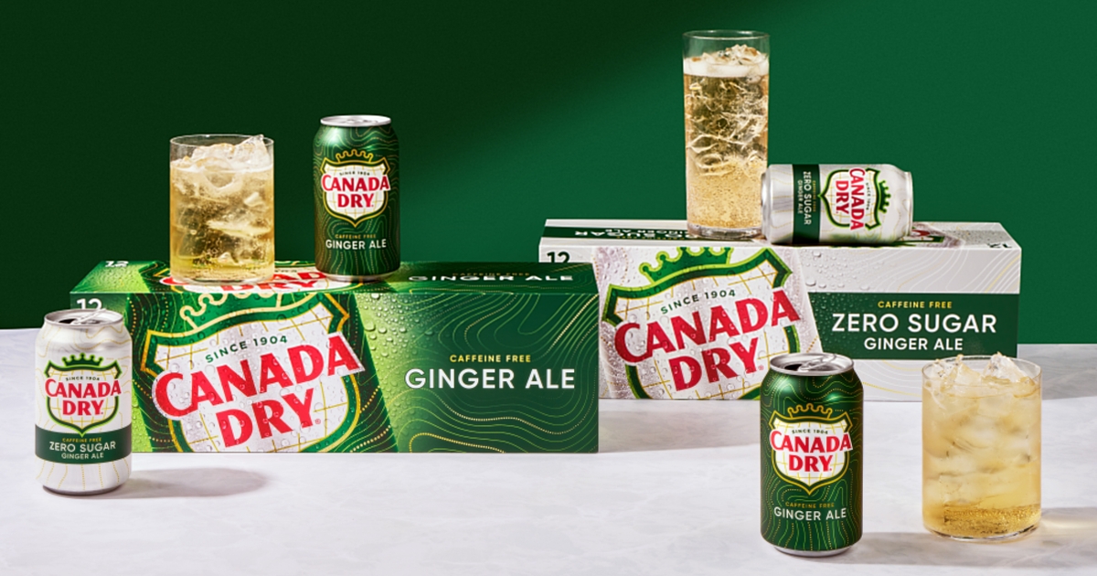
The new, more contemporary package graphics signal relaxation and comfort while retaining familiar brand elements. Canada Dry’s familiar crown and shield and its green-gold-red palette are still central to the pack design. The brand refresh was conducted together with design agency CBX.
“The crown and shield convey the brand’s long-standing history and leadership position in ginger ale. We knew it was important to maintain these key equities, but the goal was to translate them into a more modern and timeless design,” says Chris Cook, director, CBX.
New: Fruit Splash, a new permanent offering, will allow the brand to broaden its appeal. Image: Keurig Dr Pepper
To learn more, we asked Allison Kapp, senior brand manager, Canada Dry, a few questions about the project. Discover the details in this exclusive Packaging Digest interview.
Why did KDP choose to do a brand refresh for Canada Dry now?
Kapp: The brand recognized an opportunity to improve its on-shelf presence. Best known for being a beverage to relax and unwind with, we pursued these attributes in a more impactful way to stand out on the shelf.
What elements of the packaging graphics did you change, and why?
Kapp: The comprehensive brand refresh touches all Canada Dry products with all-new graphics across Ginger Ale, mixers, and seltzer water. It is the first update to the brand’s signature style in the US since 2010.
The new logo is a simplified version of the more detailed previous map design. By simplifying the logo to a white background within the shield, we can command stronger breakthroughs.
The design team used inspiration from the map inside the shield to create a new background pattern that cues refreshment through effervescence in motion.
Condensation replaces bubbles from previous packaging to represent the effervescence and refreshment that comes from drinking a Canada Dry.
How do the new graphics evoke the 120-year history of the brand?
Kapp: The new graphics blend familiarity with modernity and retain the meaningful visual elements that bridge the brand’s history — the iconic crown and shield plus its signature green, gold, and red color palette — with a significantly more modern look and feel.
The new graphics also brought back the ligature between the C and A letters that was present before 2010.
KDP partnered with design agency CBX on the refresh effort.
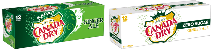
These ‘before’ images show how CBX added new sparkle while respecting brand’s visual heritage. Image: Keurig Dr Pepper
How do the new graphics cue relaxation and comfort?
Kapp: With both the effervescence in motion line work and condensation, the new graphics cue the relaxing and refreshing nature of the product that consumers have come to expect and love. These elements introduce dynamism into the design that helps it to break through and capture consumer attention.
Were there any structural changes to the packaging?
Kapp: No.
How many cans are in the Canada Dry multipacks?
Kapp: Multipacks vary in size and flavor, from six to 12 to 24.
Did you test the new flavor, Canada Dry Fruit Splash, in the market before adding it as a permanent stock-keeping unit? If so, where and when did you test, and for how long?
Kapp: Canada Dry Fruit Splash — a new permanent flavor offering — did undergo consumer testing. Results were strong for the product’s ability to broaden the appeal of ginger ale to allow us to reach more drinkers.
Is this a global packaging redesign for Canada Dry?
Kapp: The packaging refresh will impact the United States only.