Goodfella’s turned to Sun Branding, to explore how their brand proposition could look, feel and behave in a new occasion for pizza – adult midweek sharing, building on the Goodfella’s brand of Italian-American family values, authentic traditions, and great tasting food.
Returning to their Italian-American heritage, they worked with Italian makers to create a stonebaked pizza base topped with meats and cheeses. Goodfella’s Italian-American personality needed dialing up, inviting families and friends to come together for a sharing occasion.
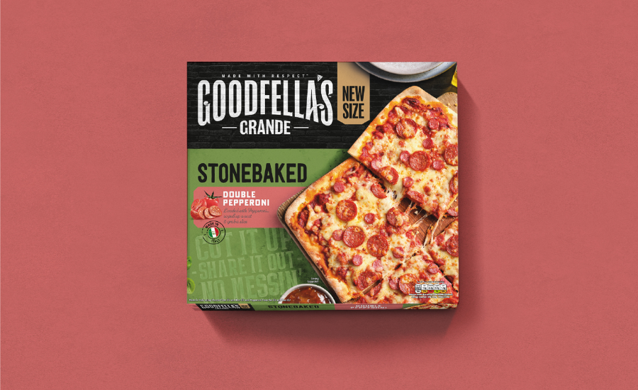
Inspired by Italian brands, Sun Branding disrupted the design-architecture to position this range in its own tier, all while retaining the recognizable core Goodfella’s identity. The design approach was simple: enhance the sharing experience, Goodfella’s’ style. The name ‘Grande’ pays homage to Italian roots, while indicating a larger size for sharing. Sun Branding integrated this into the logo lock-up to signify a new offering.
“The quality ingredients and provenance all needed to shine through with pride and care on the packaging, so we crafted a more editorial, lifestyle aesthetic that evokes the feeling of people coming together. Stacks of plates, dip bowls, and the hero – a delicious pizza being sliced and ready to share out,” reveals Si Inman, Creative Director.
Sun Branding used texture and provenance callouts to build the visual language of Italian-made pizza. Additional inspiration came from wall-painted signage found while wandering through old Italian streets, introducing brand tone of voice with “Cut it up, share it out, no messin’” painted onto the background.
“We wanted to create the energy and love of family and friends gathering to share a meal together on the packaging. Subtle use of propping helps suggest that the pizza, although the main focal point, is only part of the bigger picture and the table is set for everyone to tuck in and enjoy the feast. Fresh color palettes and elongated shadows help capture the provenance and warmth of those sunny Italian days and create a sense of joy and happiness,” explains Matt Fish, Senior Designer.