Kee Captures the Liquid Flow State of Its Collagen Supplement

Kee Captures the Liquid Flow State of Its Collagen Supplement


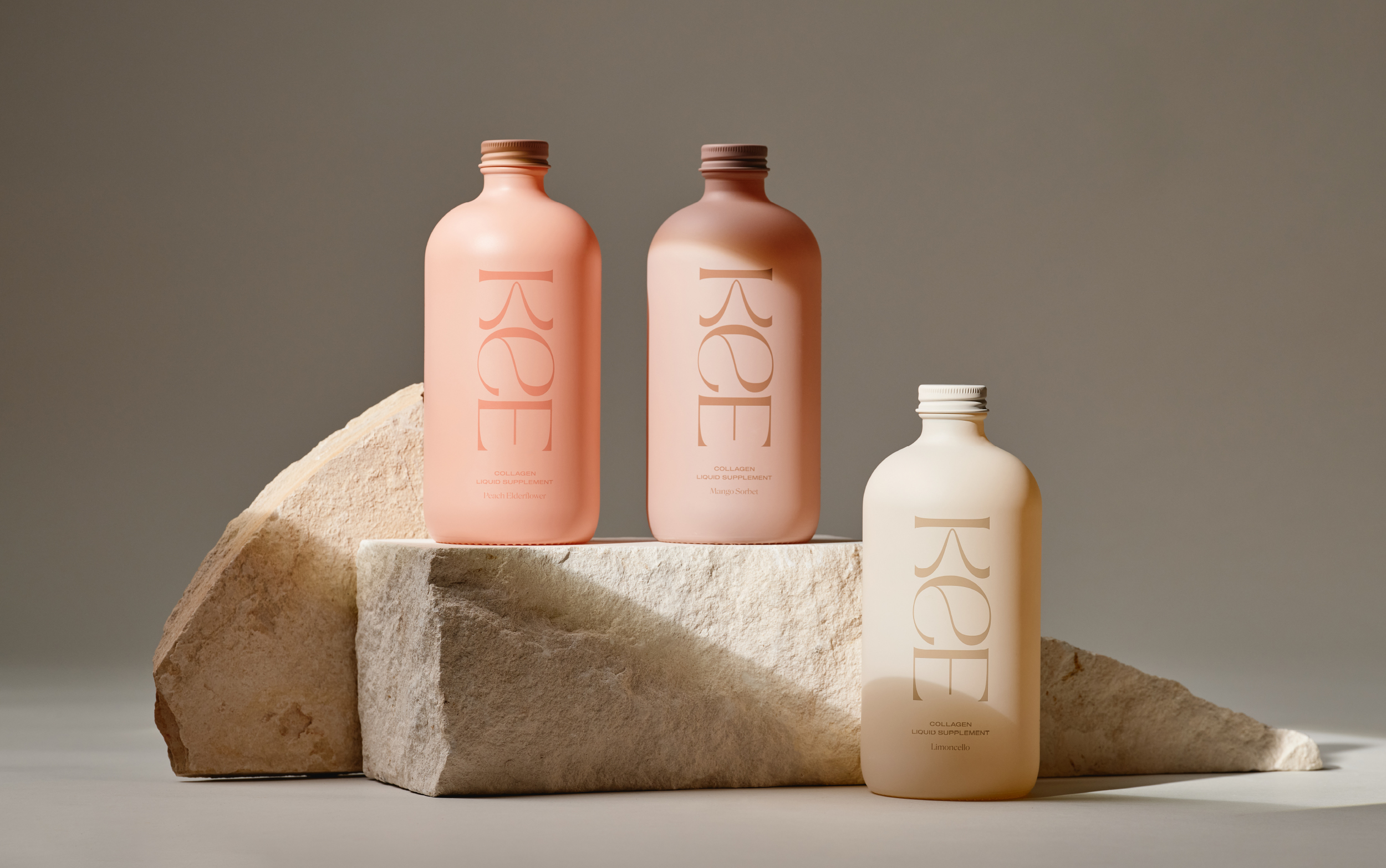
The packaging design for Kee, created by Forner, is organic sophistication visualized, with its soft, muted color palette, featuring hues that feel natural and calming, such as peach, beige, and muted greens. The custom typography is meant to mimic the movement of liquid.

The design is nuetral and simple, but with a soft, dainty appeal that’s perfect for accompanying quiet morning and night routines.


Source link

Get Packaging Industry News updates

Get the most critical Packaging Industry news in your email each week.


We promise no spam email will send you.

Leave a Reply

Your email address will not be published. Required fields are marked *

Related Articles
Europe’s competing next-gen packaging materials
Barbara RuckerApr 23, 2026

The market is evolving quickly but in a fragmented way, and no one material…

Industrial packaging faces global bottlenecks
Barbara RuckerApr 23, 2026

Logistics networks are still adjusting to congested shipping lanes and fluctuating container availability, disrupting…

The Apple Rebrand That Proves Produce Also Deserves Great Design
Barbara RuckerApr 22, 2026

Nobody expects one of the most joyful rebrands of the year to show up…

Klarina Is the Sunscreen That Finally Figured Out What Parents and Kids Actually Need
Barbara RuckerApr 22, 2026

Anyone who has tried to apply sunscreen to a moving child’s face knows that…