Move Over, Josh, There’s an Andrew Wine

Move Over, Josh, There’s an Andrew Wine


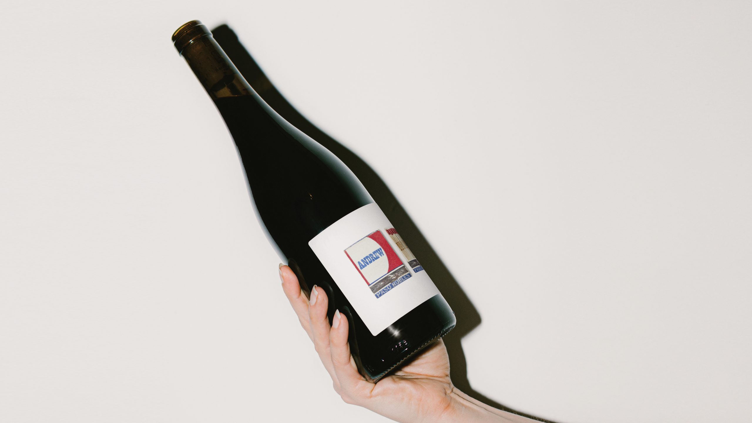
The wine packaging for “Andrew” is centered around a vintage matchbook-inspired label that feels effortlessly nostalgic. Inspired by pop art photography, each label captures the worn, lived-in feel of collected matchbooks.

The name “Andrew” is custom-typed to appear naturally aged, as if it’s been pressed into the matchbook over time, adding a timeless element to the clean design. The simple sans-serif “Andrew” wordmark balances the vintage aesthetic, creating an approachable design.

Below, Jose Garcia, creative director of Zoca Studios, sheds some light on the behind-the-scenes process of producing a label with a beautifully worn-in look and feel. 


Source link

Get Packaging Industry News updates

Get the most critical Packaging Industry news in your email each week.


We promise no spam email will send you.

Leave a Reply

Your email address will not be published. Required fields are marked *

Related Articles
Amcor in talks to offload waste management unit
Barbara RuckerMay 5, 2026

The business records €300m in annual revenue. Credit: aapsky / Shutterstock.com. Packaging giant Amcor…

Brazilian Spirit Fio de Ouro Brings the 1940s To Life
Barbara RuckerMay 5, 2026

Fio de Ouro celebrates 43 years with labels rooted in 1940s Brazilian lithograph design.…

Mirinda Refresh is All Smiles, Courtesy of PepsiCo Design & Innovation
Barbara RuckerMay 5, 2026

Mirinda unveils new visual identity, designed by PepsiCo’s Design and Innovation team. The new…

Polyester fibre manufacturer USFibers gains backing for expansion
Barbara RuckerMay 5, 2026

USFibers said the latest funding represents the next stage of its development. Credit: dee…