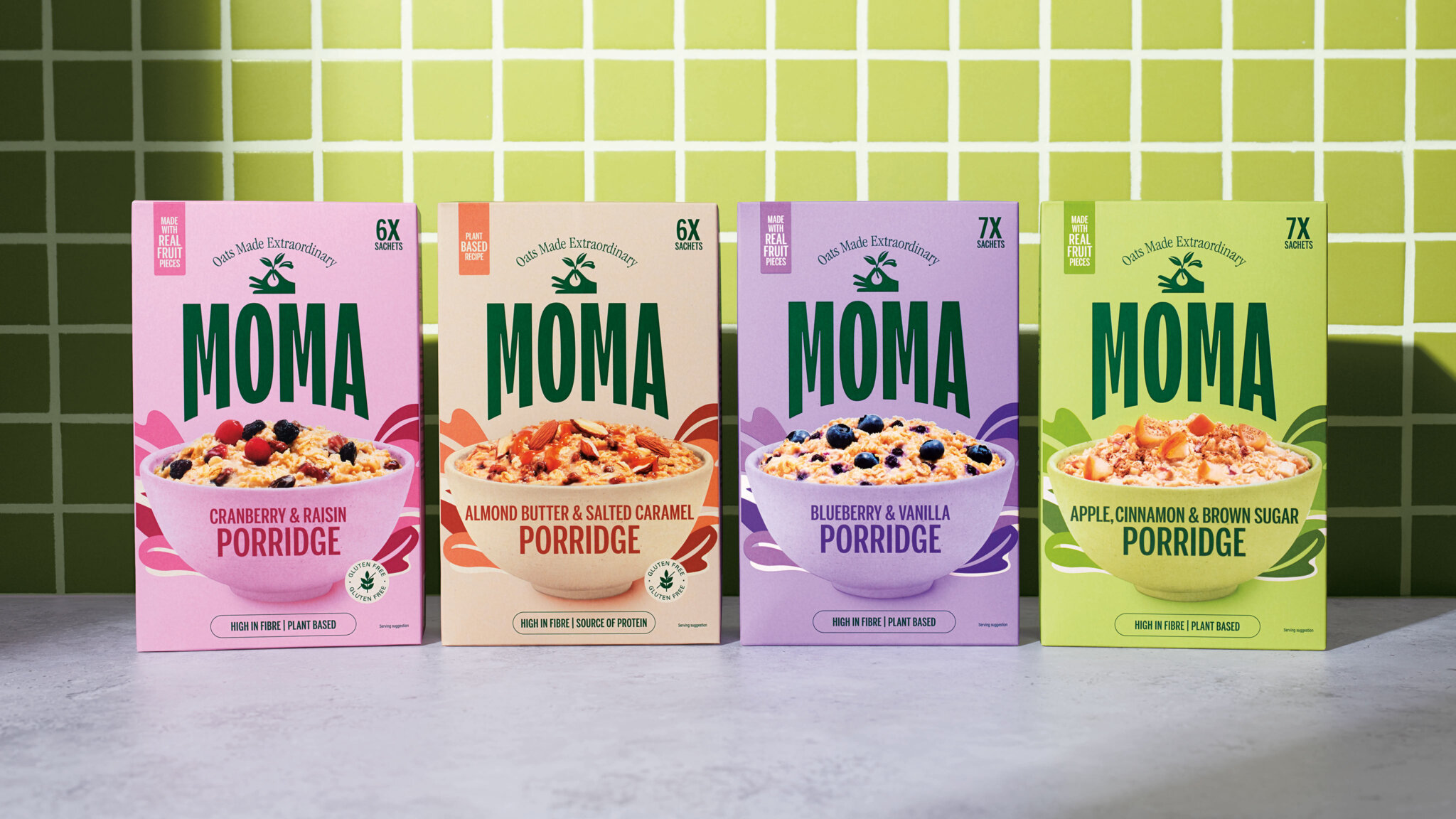
MOMA’s packaging redesign by Together Design highlights its focus on elevating oats as a versatile and nutritious staple. The new tagline, “Oats Made Extraordinary,” pairs with an illustration of a hand holding oat grasses to emphasize craftsmanship and UK-sourced ingredients.
The bold green primary palette is meant to represent health and vitality, while the Barista Oat Drink’s purple palette is intended to convey a sense of luxury. By showcasing oat drinks and porridge bowls front and center, the design simplifies shopping and emphasizes taste and nutritional benefits. The oat splashes and fruit visuals on porridge packaging create an energetic, fresh image, breaking away from more health-centered perceptions of the category.
Together Design’s creative director and co-founder, Bryony Meyrick, shares more about the design below.