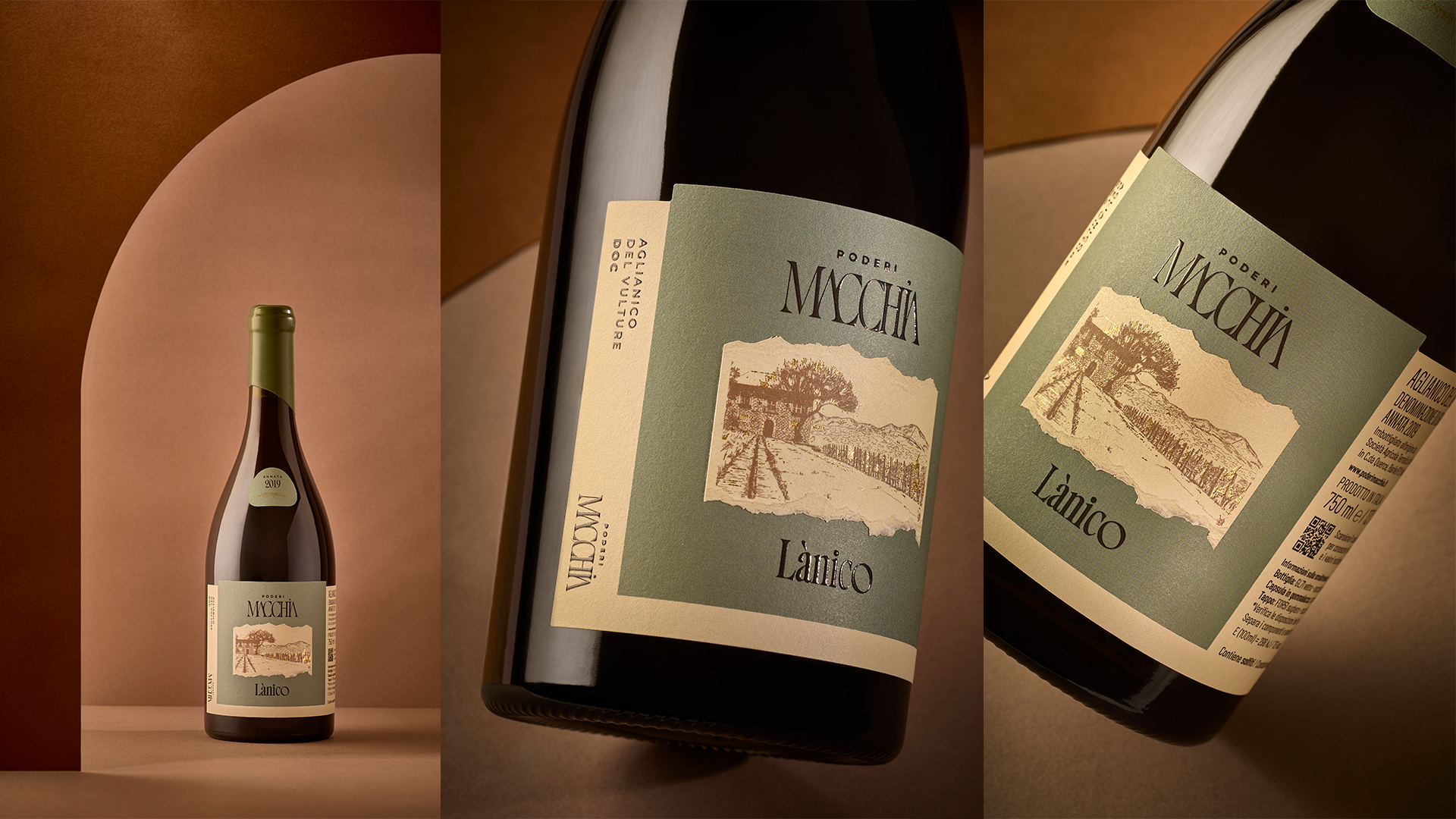
Italian wine labels are breaking free from crests and calligraphy scripts. Poderi Macchia, with packaging designed by Lillalab Creative, is a perfect example of what’s possible.
The diamond-shaped labels on the sparkling wines are the first thing you notice. Rotated on axis, they feel architectural rather than traditional, which makes complete sense given the inspiration. The arch motif drawn from the stone portals of Barile runs through the entire collection as a quiet structural thread. The typography across the range leans into a high-contrast modern serif. What Lillalab got right are all the tactile details, including the embossing, foil, and specialty papers.