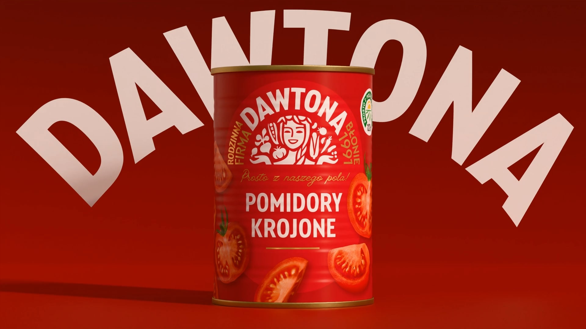
Dawtona’s new packaging by BNA delivers a bold identity rooted in its agricultural craftsmanship. The design introduces a brand character, an expressive Slavic goddess of harvest, whose face is now the focal point of the brand. The red and white palette is intensified with deep contrast, making each can and bottle feel rich and full of flavor.
The typography is strong and clear, set against illustrated produce that feels fresh and abundant. The use of an oval frame around the brand hero helps unify the portfolio while allowing flexibility across different product lines. The packaging feels warm and inviting, and by blending tradition with a bold new presence.