Momo Delivers an Unexpected Tropical Punch 

Momo Delivers an Unexpected Tropical Punch 


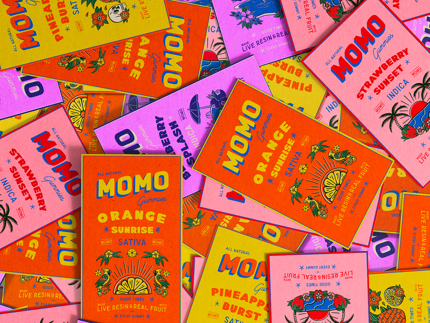
MOMO’s packaging dials up the energy with a punchy mix of bold typography, tropical-inspired illustrations, and saturated color palettes. The design leans into an almost sun-faded print aesthetic, with typography that feels slightly off-register, adding a laid-back, island-market feel.

Playful icons, including sunbursts, palm trees, and exotic fruits, reinforce the flavor experience, making each box feel like a mini postcard.

Ulysses Design Co designed a fun, high-energy look that skips classic cannabis clichés, which is always appreciated.



Source link

Get Packaging Industry News updates

Get the most critical Packaging Industry news in your email each week.


We promise no spam email will send you.

Leave a Reply

Your email address will not be published. Required fields are marked *

Related Articles
LYB, Armando Alvarez Group Advance Bio-Circular Solutions in Industrial Packaging
Barbara RuckerMay 22, 2026

At the LyondellBasell (LYB) Wesseling site in Germany, teams are collaborating with the Armando…

Jackrom selects ROTOCON to enhance packaging production
Barbara RuckerMay 22, 2026

Jackrom and ROTOCON executives. Credit: Jackrom and ROTOCON. Venezuelan printing business Jackrom has placed…

Jollie Made Collagen Look So Good You’ll Want to Eat the Box
Barbara RuckerMay 22, 2026

Collagen jelly sticks aren’t new, but Jollie’s packaging, designed by Daria Shiian, makes you…

dummy-img
Pour One Out for the Glass Bottle? Noiseless Just Made Vodka in Pouches
Barbara RuckerMay 22, 2026

Besides a basement frat party, the spirits category is still largely married to glass.…