Corvo House Coffee’s Packaging Invites You To Drink Crow

Corvo House Coffee’s Packaging Invites You To Drink Crow


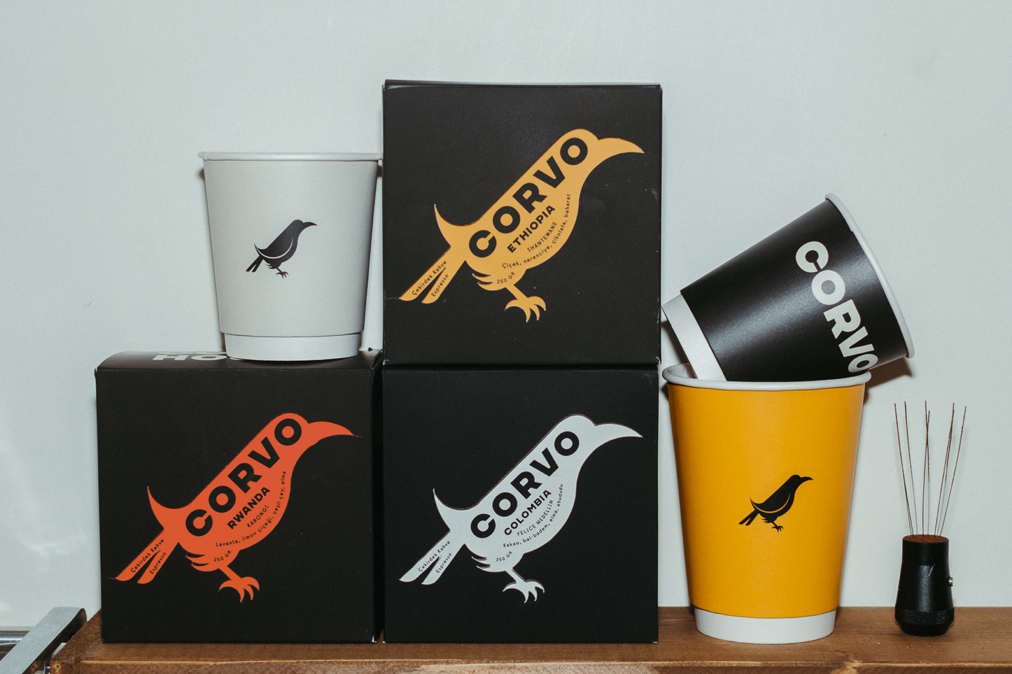
Ceren Burcu Turkan’s packaging for Corvo House Coffee leans into bold minimalism with a striking interplay of black, white, and deep-toned accent colors.

The raven-shaped logotype merges branding and storytelling, reinforcing the name “Corvo.” The matte black boxes paired with orange, yellow, and crisp white create a sleek, high-contrast look. The typography is clean and confident, with a sharp layout that feels both utilitarian and expressive. The design pulls from sharp graphic iconography, adding a sense of intrigue.


Source link

Get Packaging Industry News updates

Get the most critical Packaging Industry news in your email each week.


We promise no spam email will send you.

Leave a Reply

Your email address will not be published. Required fields are marked *

Related Articles
The Recycling Partnership Launches New Initiative to Boost Recycling Participation
Barbara RuckerJun 12, 2026

The Recycling Partnership (The Partnership) has announced a Recycling Participation Fund, backed by Arconic,…

Turner Duckworth Refreshes McDonald’s Sub-Brand McCafe As Part Of Larger Beverage Push
Barbara RuckerJun 12, 2026

McCafe, McDonald’s beverage sub-brand, gets a refresh by Turner Duckworth. The update comes as…

This Ain’t Your Grandma’s (Fig) Newtons
Barbara RuckerJun 12, 2026

Newtons’ branding and packaging design have been updated. The update aims to connect with…

Poderi Macchia’s Tactile Design System Is Shaped by Architecture
Barbara RuckerJun 12, 2026

Italian wine labels are breaking free from crests and calligraphy scripts. Poderi Macchia, with…