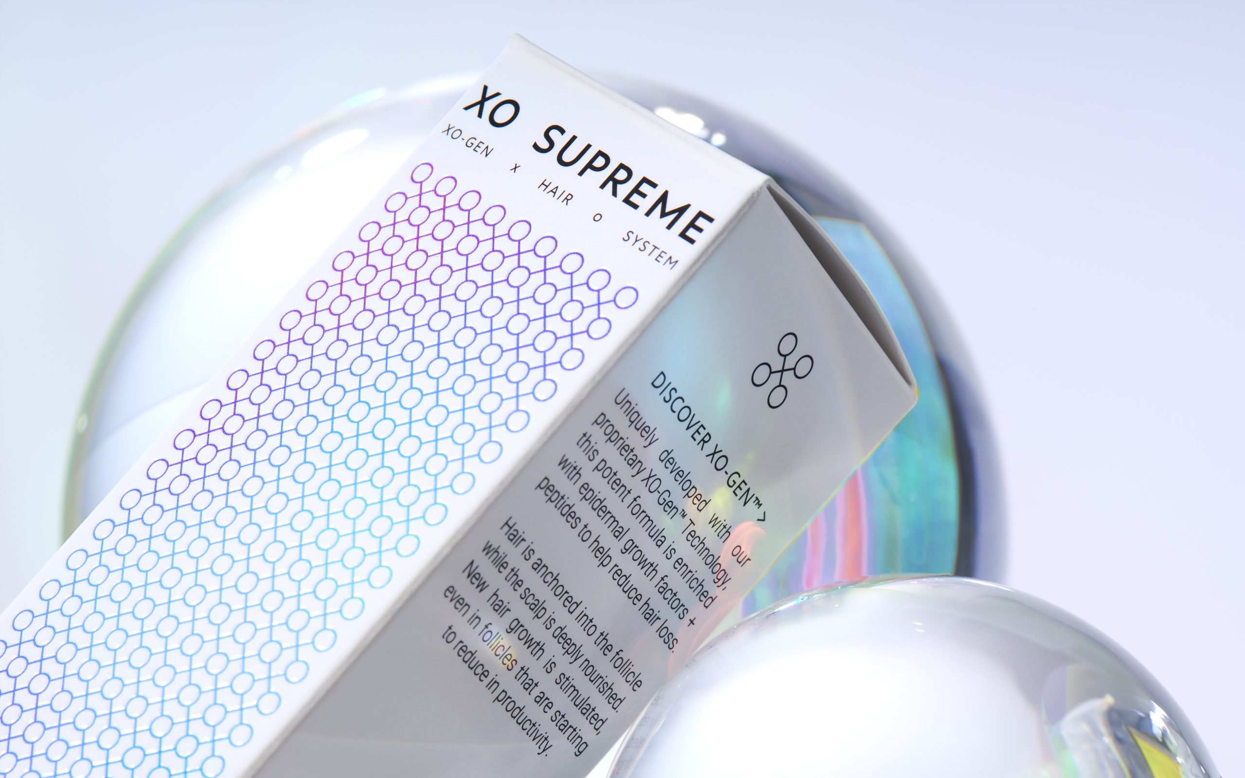
XO SUPREME, designed by Mid-Air Studio, is an innovative range of hair and skincare products capturing the clinical power of exosomes. Mid-Air Studio created a system of interconnected X and O symbols forming a pattern grid as the brand’s core visual architecture. The gradient color scheme, overlaid with transparent holographic foil, makes the packaging look incredibly structured, clean, and clinical.
An innovative range of hair + skincare capturing the clinical power of exosomes, a key new trend in skin + hair rejuvenation. These microscopic molecules send signals between the skin cells, creating connections, prompting regeneration + renewal at a cellular level. As an expression of the action of these spherical exosomes, we created a system of interconnected x and o symbols that combine to create a pattern grid that forms the core visual architecture of the brand ID. From this XO grid, smaller sections were then extracted to create a signature X motif and then distilled further to a single unit xo icon. These modular symbols are applied within an invisible grid of the larger XO pattern, with all elements applied at the same scale across touch points to reflect the clinical precision + the concept of molecular building blocks. The XO grid pattern is executed in a pink-spectrum gradient for the skincare range and a blue-spectrum gradient for the haircare range. These base colour gradients have then been overlaid with a transparent holographic foil to capture the active dynamism of the formulations and to add vibrancy to the soft-touch clinical white canvases of cartons, glass bottles, tubes and tins.
– Mid-Air Studio