Alby’s No-Frills Packaging Nails the Spirit of the Aussie Pub

Alby’s No-Frills Packaging Nails the Spirit of the Aussie Pub


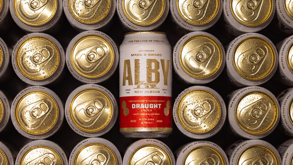
Alby’s packaging, designed by Studio Papa’s Marcus Taylor, leans into pub culture without overdoing it. The cans use a clean gold-and-white base punctuated by bold, condensed lettering that’s straight to the point.

The red and yellow color blocks help differentiate between the Draught and Crisp offerings. There’s a sense of utility to the layout; it feels familiar, sturdy, and best served with a side of fish and chips.


Source link

Get Packaging Industry News updates

Get the most critical Packaging Industry news in your email each week.


We promise no spam email will send you.

Leave a Reply

Your email address will not be published. Required fields are marked *

Related Articles
Sappi to Showcase Sustainable Tea Packaging at interpack
Barbara RuckerApr 15, 2026

At this year’s interpack, Sappi will be highlighting its latest innovations in sustainable tea…

Amcor Invests in New Printing Line at Hardenberg Facility
Barbara RuckerApr 15, 2026

Amcor, a global leader in developing and producing responsible packaging solutions, has made a…

Tessas Eplegård Cider Explores Honest, Farm-Friendly Storytelling
Barbara RuckerApr 15, 2026

While the rest of the cider world is leaning into rustic scripts and moody…

Pasta Fortuna Tells the Story of a Mother’s Love and a Land of Tradition
Barbara RuckerApr 15, 2026

There’s no denying that the CPG design world is deep in its maximalist renaissance,…