Tolmanns Gin’s Redesign Packs a Punch

Tolmanns Gin’s Redesign Packs a Punch


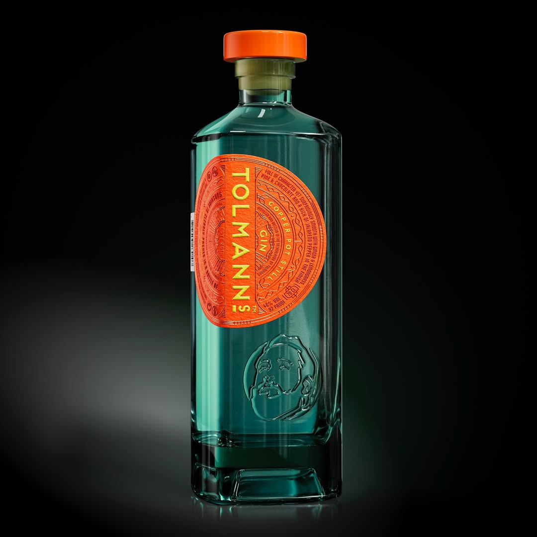
Tolmanns’ new packaging by VHD Packaging Design ditches the stiff look of the old design for something punchier and more tactile. The bottle’s sharp edges and embossed portrait give it presence, while the oversized circular label, set vertically, anchors the brand name in a bold sans-serif.

Each variant gets an ownable pop of color, think burnt orange, deep blue, electric yellow. The label reads like a seal or coin, packed with tiny text that hints at craftsmanship without being showy. It’s structured, but still playful.


Source link

Get Packaging Industry News updates

Get the most critical Packaging Industry news in your email each week.


We promise no spam email will send you.

Leave a Reply

Your email address will not be published. Required fields are marked *

Related Articles
UK to consult on recycled plastic under packaging tax
Barbara RuckerMay 19, 2026

The government will review submissions and issue a formal response at a later stage.…

Mondi redesigns packaging for Ovoko car parts shipments
Barbara RuckerMay 19, 2026

Mondi adapted an existing heavy-duty packaging design for e-commerce use. Credit: Mondi / Ovoko.…

International Paper acquires Delmarva Corrugated Packaging
Barbara RuckerMay 19, 2026

In the first quarter of 2026, International Paper posted net sales of $5.97bn, an…

Bob's Red Mill Unveils New Logo and Product Packaging
Barbara RuckerMay 18, 2026

Bob’s Red Mill, a leader in the homemade food movement for nearly 50 years,…