Orika’s Packaging System Tingles the Senses

Orika’s Packaging System Tingles the Senses


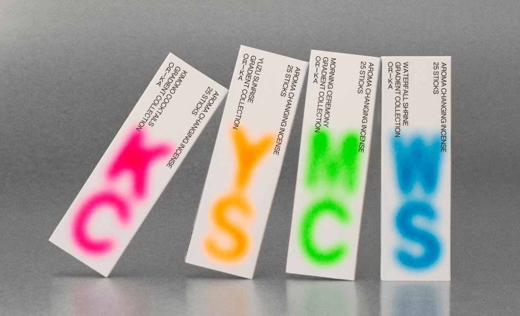
Orika’s packaging, designed by SMLXL Company and Principi, plays with contrast in both visual and cultural ways. The outer box is ultra-clean, using a sans-serif typeface that feels almost architectural.

What breaks the grid is the sprayed-on gradient lettering in electric shades that look airbrushed onto the matte surface. The aesthetic lands somewhere between a Tokyo subway sign and a Brooklyn art book. It’s minimal, but not simple.


Source link

Get Packaging Industry News updates

Get the most critical Packaging Industry news in your email each week.


We promise no spam email will send you.

Leave a Reply

Your email address will not be published. Required fields are marked *

Related Articles
Fox Solutions Partners with JASA to Bring Fully Automated Packaging Solutions for Produce
Barbara RuckerJun 8, 2026

Fox Solutions has entered into a strategic partnership with JASA, a Netherlands-based leader in…

100 Top Designers Used Chocolate Bar Wrappers  as a Canvas for AGI Open 2025
100 Top Designers Used Chocolate Bar Wrappers as a Canvas for AGI Open 2025
Barbara RuckerJun 8, 2026

Base Saigon partnered with Marou Chocolate for AGI Open to have 100 top designers…

Sowvital Leans Into The Power of Embossing
Barbara RuckerJun 8, 2026

Blind embossing without ink dates back to 15th-century bookbinding, but right now we’re seeing…

Drip Coffee or a Matisse-Inspired Chinese Zodiac?
Barbara RuckerJun 8, 2026

Drip Coffee’s Zodiac Series, designed by NON STOP, is delivered with an energy that…