Eat Wasted’s Typography Turns Up the Volume

Eat Wasted’s Typography Turns Up the Volume


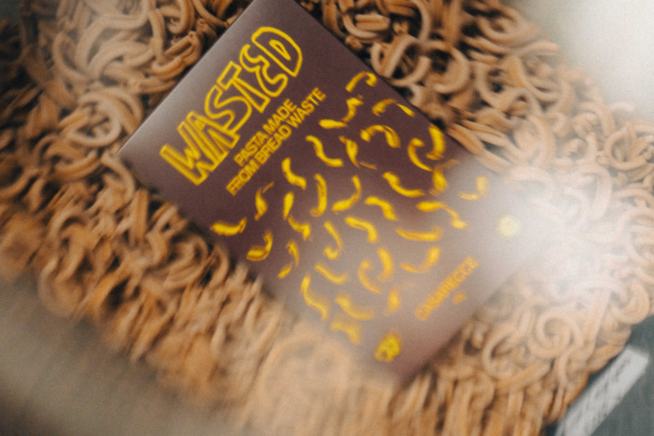
WASTED’s packaging leans hard into irreverence, starting with the jagged, off-kilter logotype that feels like it was scrawled on pack. Designed by in-house designer Jorge Aguilar, the typography is purposefully unpolished and almost chaotic, evoking the energy of zines or DIY punk posters.

It’s impossible to ignore, contrasting sharply with the tidy, all-caps secondary text below. The box itself is a matte brown with a banana-yellow print, covered in squiggly noodle illustrations that echo the brand’s anti-waste ethos with just the right amount of playfulness.


Source link

Get Packaging Industry News updates

Get the most critical Packaging Industry news in your email each week.


We promise no spam email will send you.

Leave a Reply

Your email address will not be published. Required fields are marked *

Related Articles
The Recycling Partnership Launches New Initiative to Boost Recycling Participation
Barbara RuckerJun 12, 2026

The Recycling Partnership (The Partnership) has announced a Recycling Participation Fund, backed by Arconic,…

Turner Duckworth Refreshes McDonald’s Sub-Brand McCafe As Part Of Larger Beverage Push
Barbara RuckerJun 12, 2026

McCafe, McDonald’s beverage sub-brand, gets a refresh by Turner Duckworth. The update comes as…

This Ain’t Your Grandma’s (Fig) Newtons
Barbara RuckerJun 12, 2026

Newtons’ branding and packaging design have been updated. The update aims to connect with…

Poderi Macchia’s Tactile Design System Is Shaped by Architecture
Barbara RuckerJun 12, 2026

Italian wine labels are breaking free from crests and calligraphy scripts. Poderi Macchia, with…