Kinnie’s New Look Hits Hard with Citrus Geometry and Retro Punch

Kinnie’s New Look Hits Hard with Citrus Geometry and Retro Punch


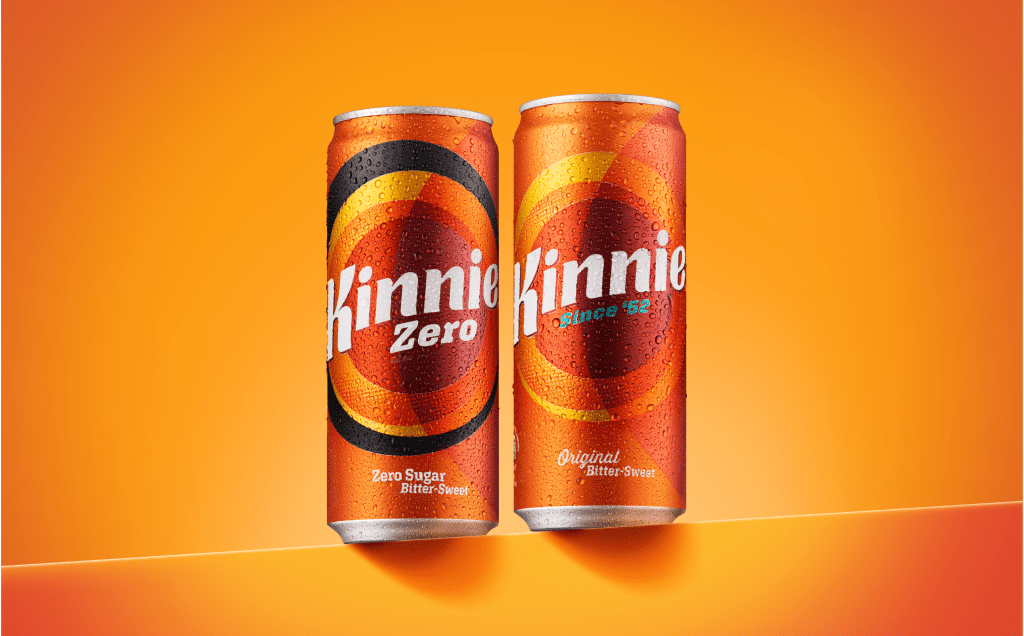
bluemarlin’s redesign for Kinnie doesn’t hold back on color or geometry. A bold ring system creates a visual bullseye that doubles as a flavor signal that’s warm, bitter-sweet, and citrusy.

The logotype is slanted, chunky, and confidently off-center, paired with clear calls like “Zero Sugar” or “Since ’52” that keep it grounded. On both cans and bottles, the layout is clean but still packed with energy. It’s not subtle, but it doesn’t need to be.


Source link

Get Packaging Industry News updates

Get the most critical Packaging Industry news in your email each week.


We promise no spam email will send you.

Leave a Reply

Your email address will not be published. Required fields are marked *

Related Articles
Bar Soap Is Back, and Ghilli Is Making It the Most Beautiful Thing in Your Bathroom
Barbara RuckerApr 16, 2026

Ghilli and allink turned the bar soap box into a Mediterranean design object, pairing…

Mitica Signals Attainable Luxury, and In the Cheese Aisle Of All Places
Barbara RuckerApr 16, 2026

Mitica by Design Womb wraps Parmigiano Reggiano in saturated matte paper and gold foil,…

Imperial Dade Canada to purchase Enterprise Paper
Barbara RuckerApr 16, 2026

Enterprise Paper was established in 1973 and operates in British Columbia and Alberta. Credit:…

Amcor invests in Netherlands plant to enhance industrial film capabilities
Barbara RuckerApr 16, 2026

The line is expected to add printing capacity of as much as 6,000tpa of…