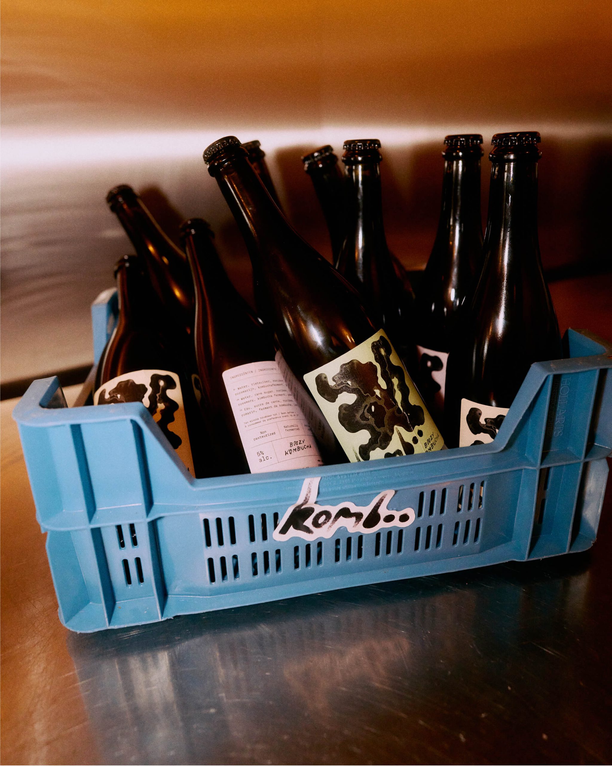
Komboo’s packaging, designed by gillesvalk.be, leans hard into bold abstraction. The label features a fluid black form sprawled across a muted green background, punctuated by tiny stippled details that pull you in.
The hand-drawn “Komboo” wordmark anchors the design with an unpolished, almost impulsive energy, while “Boozy Kombucha” sits neatly beneath. It’s the kind of branding that practically dares you to pick it up, glass in hand, and pour.