I just wrote a piece on gendered branding, and when I first heard about the cereal called Man Cereal, I rolled my eyes.
But now that the packaging has finally been revealed, I find myself pleasantly surprised. Sure, it’s gendered branding, but I don’t hate it. In fact, I kind of like it. It’s a classic Day Job special, a design so unexpectedly offbeat that it instantly wins you over.
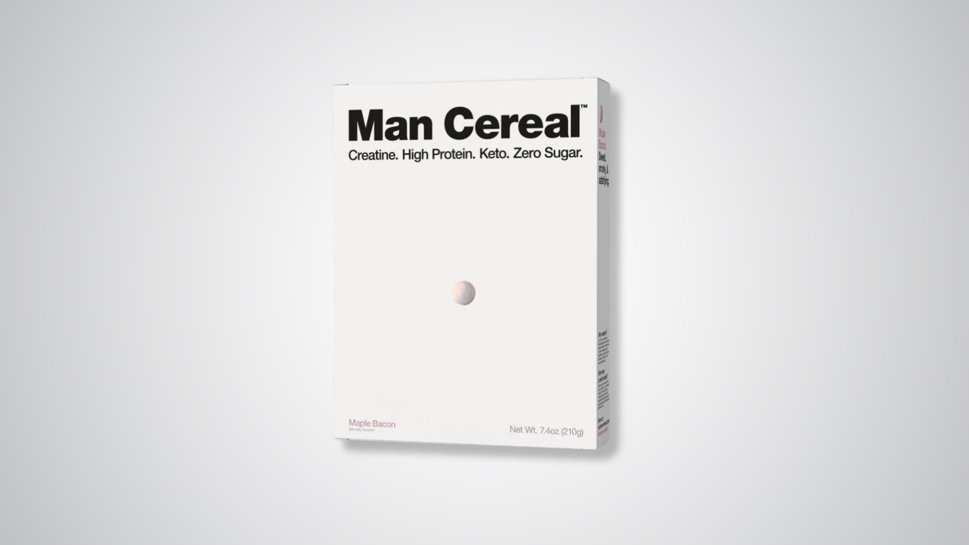
If you closed your eyes and imagined what Man Cereal might look like, you’d never picture a crisp white box with a lone cereal piece dead-center. But that’s exactly what Day Job dreamt up. The design takes a very blunt approach to packaging that’s almost aggressively minimal. The box is all white, with the name in heavy black sans-serif type dominating the top. Below, a single cereal piece sits dead center. That’s it. No overflowing bowls, no fake milk splashes, no action photography. It’s so pared back that it almost dares you to question whether this is even real.