A Bouquet of Bold Type and Even Bigger Flavor

A Bouquet of Bold Type and Even Bigger Flavor


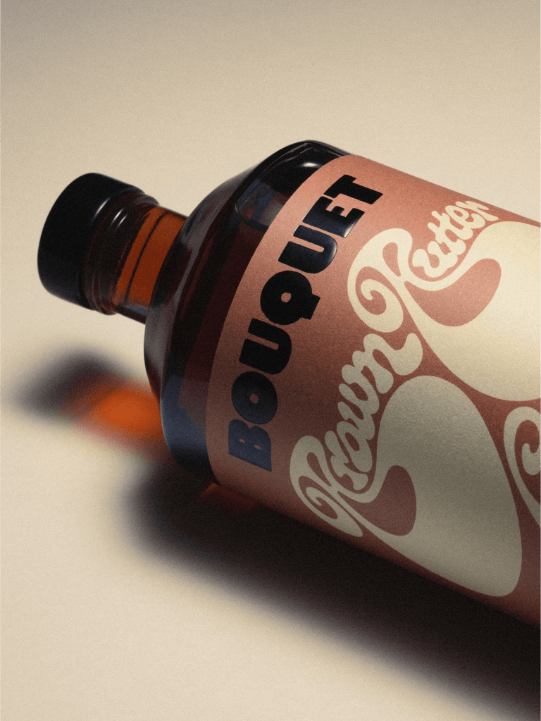
Bouquet, designed by Walk A Thought, pairs bold branding with playful typography that shifts style from flavor to flavor. Each label keeps the brand name locked in a chunky, high-impact typeface, while the flavor names dance in exaggerated letterforms, swelling, looping, or stretching to match their character.

The color blocking is unapologetically bright, letting each variant own its space on the shelf. Minimal supporting text and clean bottle shapes keep the focus on the graphic punch, making the lineup feel like a curated series.

Walk A Thought‘s own Rasmus Anilsson shares insights on the design process below.


Source link

Get Packaging Industry News updates

Get the most critical Packaging Industry news in your email each week.


We promise no spam email will send you.

Leave a Reply

Your email address will not be published. Required fields are marked *

Related Articles
Alpa’s Gluten-Free Pasta Looks Like It Belongs in an Upscale Trattoria
Barbara RuckerJun 18, 2026

We don’t often see brands lead with design first if there’s a functional aspect…

CVS Swaps Plastic OTC Bottles for Aluminum
Barbara RuckerJun 18, 2026

CVS is replacing the plastic bottle packaging for their store brand allergy and pain…

Stillbound Receives a Brandy Bottle Built for the Campfire Crowd
Barbara RuckerJun 18, 2026

Not to be rude, but brandy feels mostly boring these days. But Stillbound, designed…

4 things small businesses forget to order with their
Barbara RuckerJun 18, 2026

TL;DR Summary Ordering boxes is the easy part. It’s everything that goes with them…