Straight Forward Design takes inspiration from Starbust’s signature shape for brand refresh.
The post Starburst’s New Bespoke Typeface Proves It’s Hip To Be Square(ish) appeared first on DIELINE.
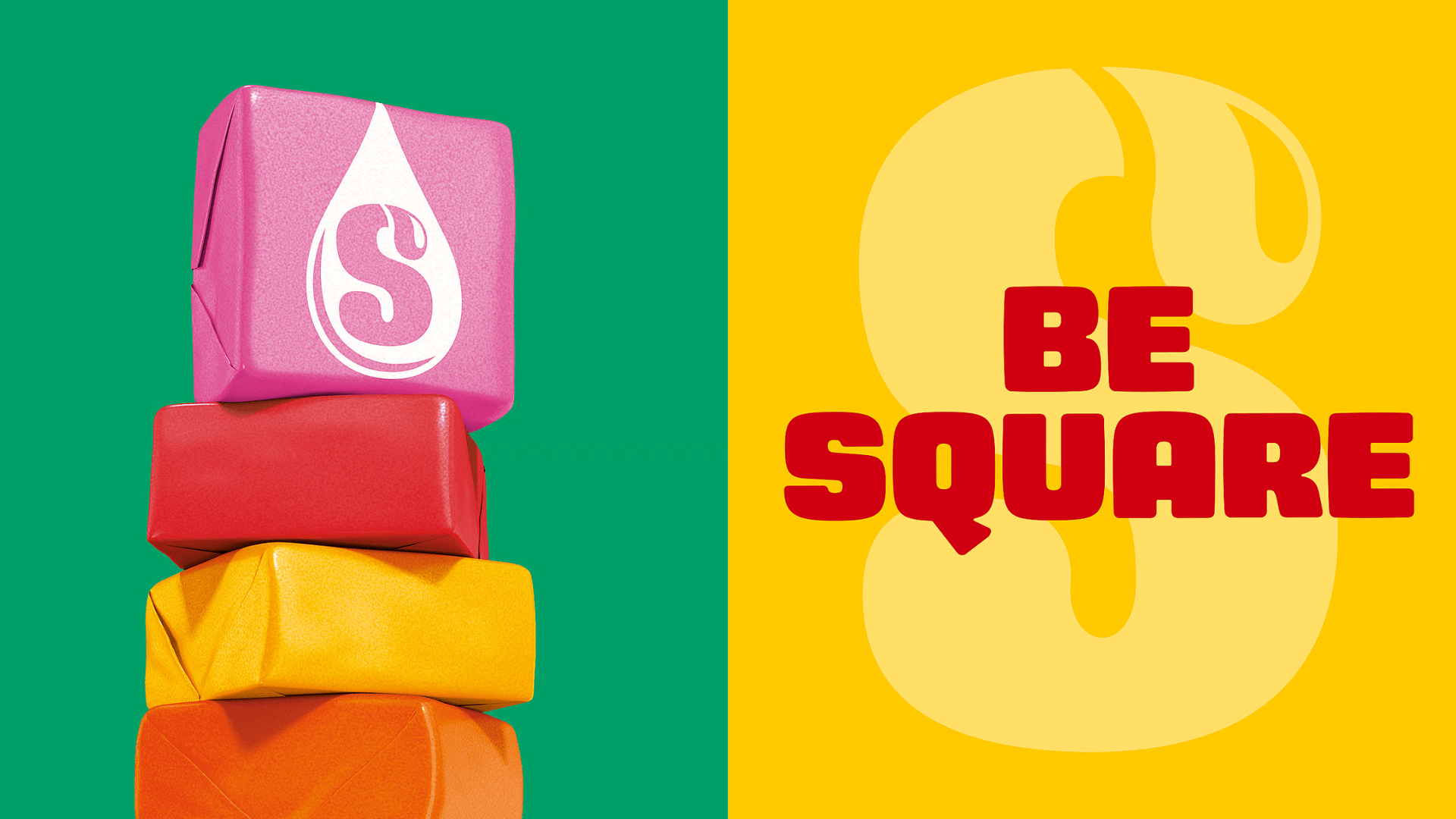
Straight Forward Design takes inspiration from Starbust’s signature shape for brand refresh.
The post Starburst’s New Bespoke Typeface Proves It’s Hip To Be Square(ish) appeared first on DIELINE.

The Recycling Partnership (The Partnership) has announced a Recycling Participation Fund, backed by Arconic,…

McCafe, McDonald’s beverage sub-brand, gets a refresh by Turner Duckworth. The update comes as…

Newtons’ branding and packaging design have been updated. The update aims to connect with…

Italian wine labels are breaking free from crests and calligraphy scripts. Poderi Macchia, with…