Whitstable Bay’s Beer Was Made For The Coast

Whitstable Bay’s Beer Was Made For The Coast


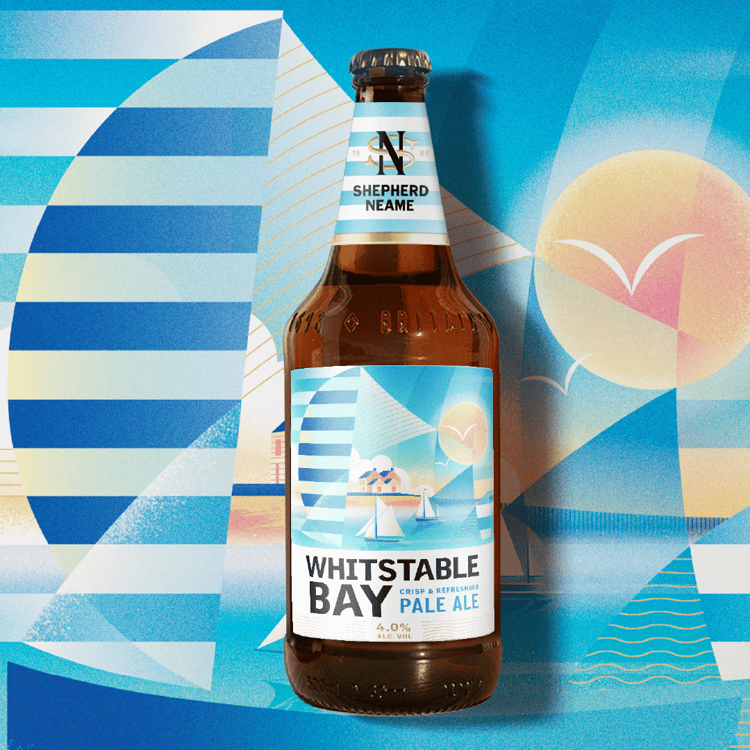
Whitstable Bay’s new look, designed by Thirst, leans into a seaside postcard aesthetic, the opposite of most beer packaging. The labels are bright and geometric, using sun-drenched gradients of blue and yellow that feel more like coastal vacation posters than anything else.

The neck labels extend the striped motif, tying the whole bottle together visually, it’s a rare move in beer branding where the neck is often an afterthought. Paired with clean, stacked typography that keeps the name front and center, the result is packaging that feels more like it was made for warm summer days and not a dark pub.


Source link

Get Packaging Industry News updates

Get the most critical Packaging Industry news in your email each week.


We promise no spam email will send you.

Leave a Reply

Your email address will not be published. Required fields are marked *

Related Articles
Buckeye Corrugated, Inc. (BCI) Expands Reno Capabilities with Advanced Equipment
Barbara RuckerApr 16, 2026

Buckeye Corrugated, Inc. (BCI) today announced the installation of critical production equipment at its…

Cattyfeast Turns Cat Food Into Design Purrfection
Barbara RuckerApr 15, 2026

REWOT s.r.l. gave FIDOVET’s Cattyfeast gold foil cans and a saturated flavor-coded palette that…

The Return of the Stubby? Garage Beer Bets on Stout Bottles and 24-Can Buckets
Barbara RuckerApr 15, 2026

Garage Beer resurrects the stubby bottle and drops a 24-pack hardware bucket to stand…

Geopolitical risk reshapes packaging investment case
Barbara RuckerApr 15, 2026

Investors are shifting their focus beyond traditional growth metrics to examine how well companies…